2020 Festival recap created by Tim Galang
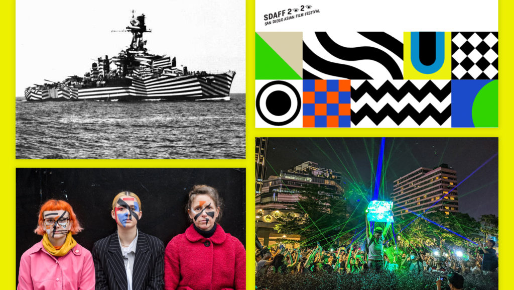
Experiments with (In)visibility
In the midst of a global uprising against anti-Blackness and a fascist surveillance state, the brand concept drew from the experience of being seen and unseen and the tactics employed to control a narrative. Taking inspiration from Hong Kong anti-surveillance tactics and a history of battleship camouflage called “dazzle,” the branding team proposed bold shapes and colors to be both cryptic and loud. It was a commentary on unapologetically uplifting Asian and Asian American perspectives on our own terms while knowing, to the mainstream, we would be hidden in plain sight. Special thanks to Christina Ree for Art Direction and Darlene Portades for the brand and website design!
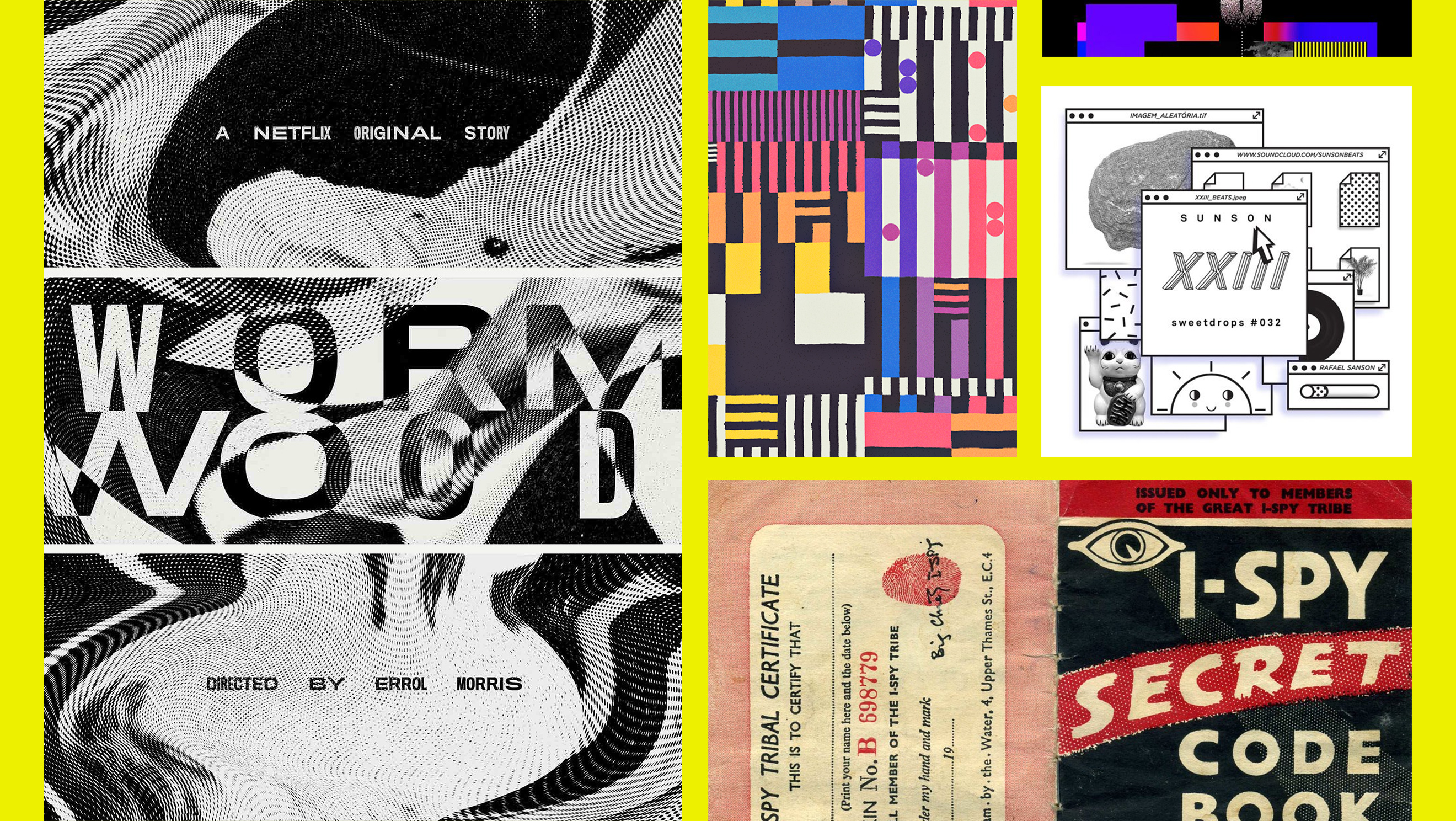
Rainbow Glitch Surveillance
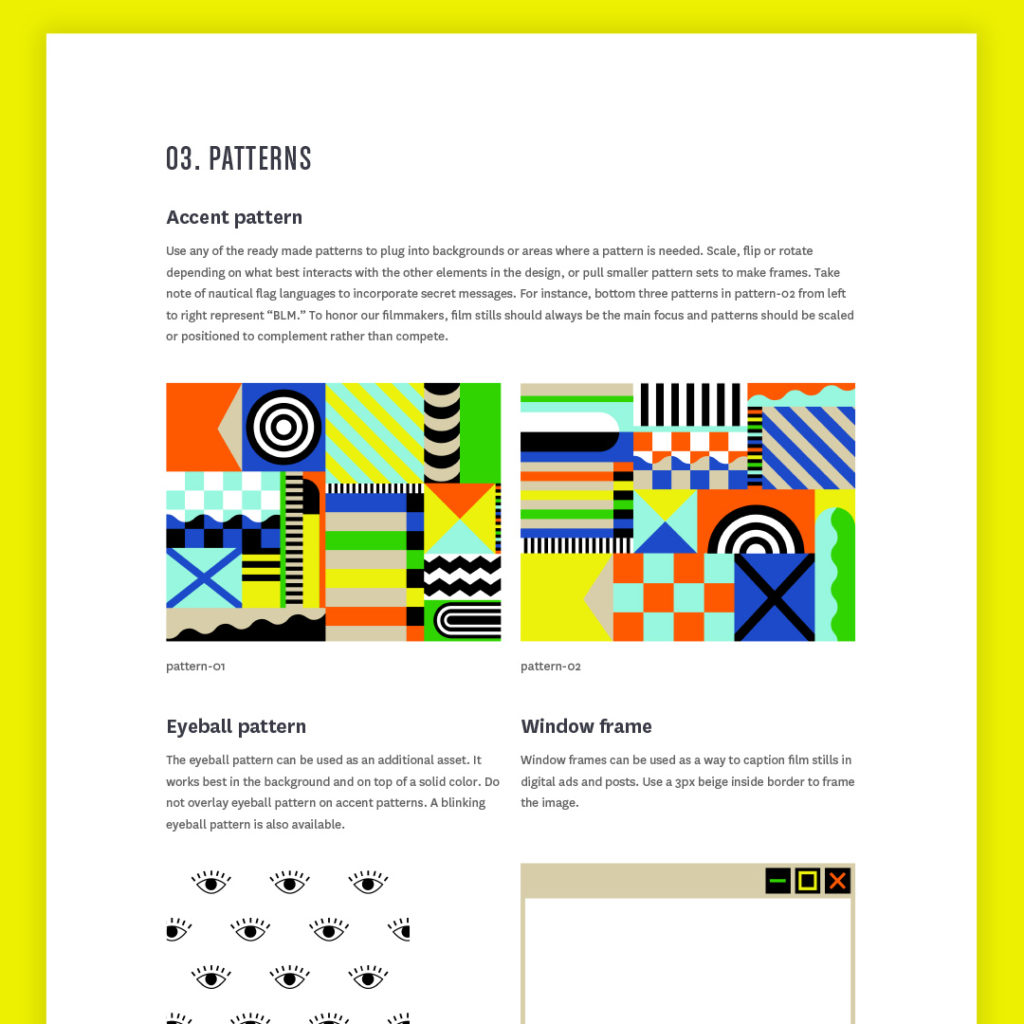
As a Graphic Design Coordinator, my task was to translate the logo, color palette and website hero into a design language for marketing campaigns, video activations, events and merchandise. Because of the stealth nature of the brand concept, I wanted to bring in elements that evoked retro spy culture and a glitchy rainbow static feel. Using nautical flag language I developed pattern swatches that could be scaled or divided across multiple assets for the rest of the graphic design team to use.
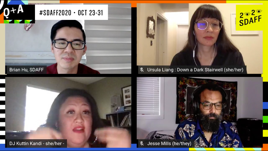
Screenshot of filmmaker Q&A hosted by PacArts Artistic Director Brian Hu, featuring Down a Dark Stairwell director Ursula Liang, Asian Solidarity Collective Executive Director and Co-Founder DJ Kuttin Kandi, and Black Lives Matter San Diego organizer and Professor Jesse Mills
We used Streamyard to broadcast Q&A’s with filmmakers, and the digital environment needed to feel every bit a part of the festival. The studio was branded with multiple backgrounds to choose from like patterned borders or blinking eyeballs.
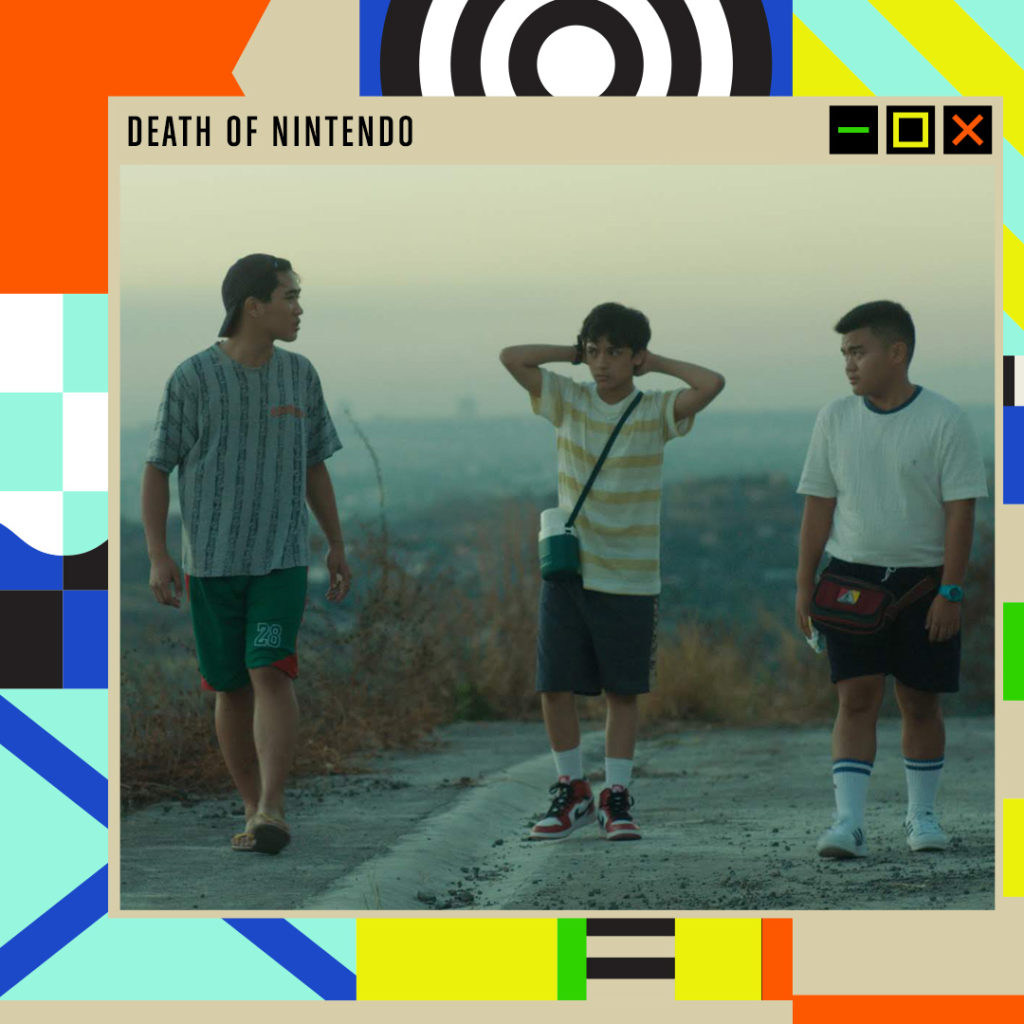
Communicating the Brand
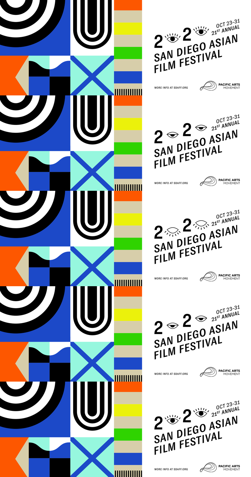
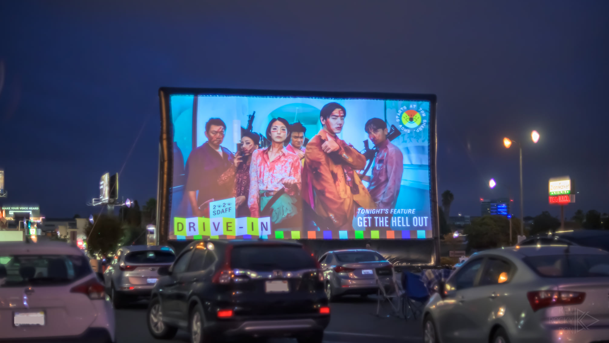
I crafted a style guide to help the design team produce consistently for a brand being built as we created for it. Because of the size and overall brightness of the color palette, the complementary color and accessibility guidelines were vital to creating consistent work. We worked with the social media team to understand their needs and created a system of templates built in Canva to empower them to create content without us. I also designed animations for the drive-in experience, film festival trailer, and live show announcements. In a mostly digital event, movement and playfulness were key to bringing the in-person feel to people’s living rooms and computers.
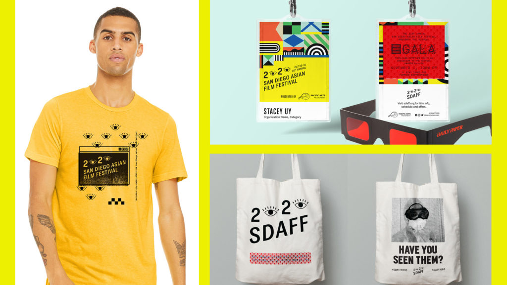
Secret Messages from SDAFF HQ.
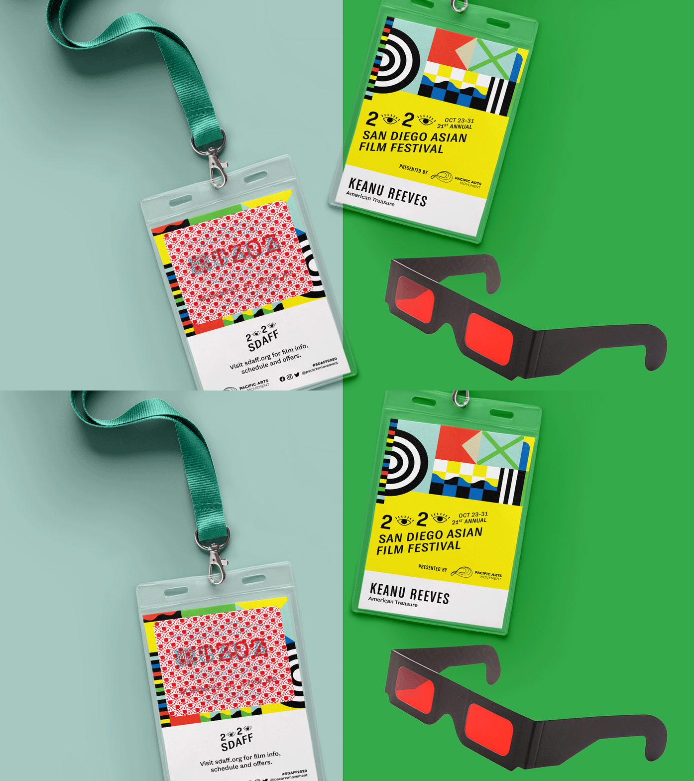
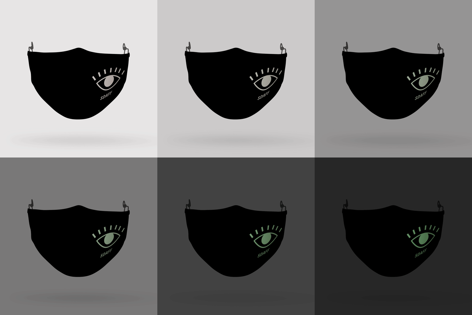
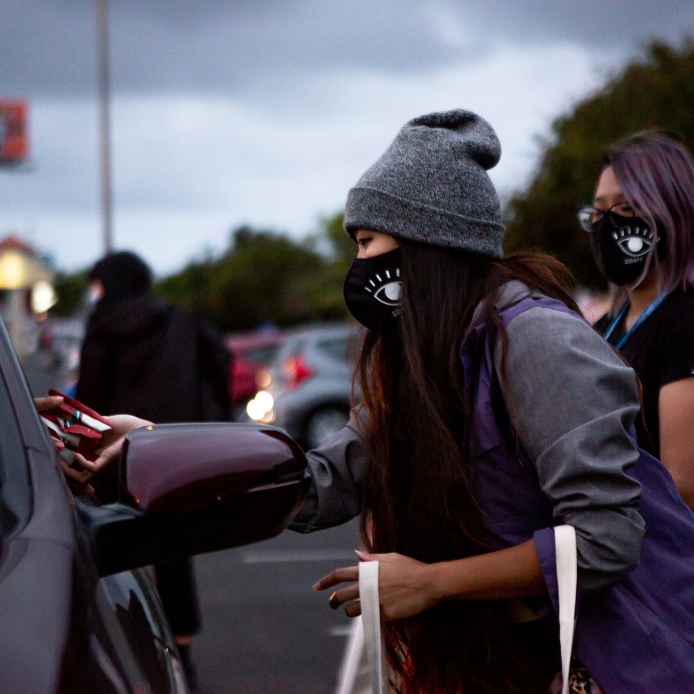
Because we couldn’t be together for the festival, merchandise became an experience within itself. The backs of badges utilized a secret code pattern that when viewed through decoder glasses, revealed the invitation to the Awards Gala. And the masks featured glow in the dark eyeballs.
Team Roles
- Stacey Uy, Graphic Design Coordinator
- Darlene Portades, Brand and Website Designer
- Christina Ree, Art Direction
- Alice Chau, Publication Designer
- Grace Ramos, Video Production Coordinator
- Tim Galang, Video Production Lead
- Carmela Prudencio, Marketing and Communications Director
