Branding direction.
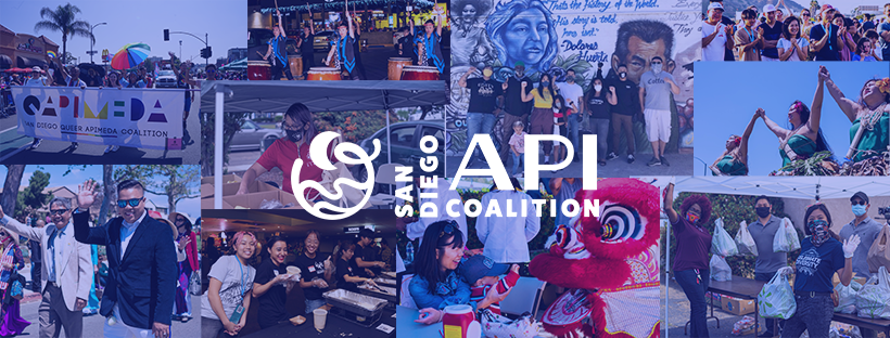
During our brand interview, the Co-Chairs expressed a longing to realize the hope and potential within our communities. I wanted to recast familiar nodes of Asian and Pacific Islander cultures to reflect how we already have what we need to create change. A mood board was used to communicate the shared energy and passion within our various cultural identities. Building upon the level of care and love we feel within our biological and chosen families, we could more easily imagine a network where resources and power are shared. Most of all, I wanted it to be loud and joyful so that our presence would be known and felt deeply.

The four brand feeling guideposts I proposed were Communal, Devoted, Nourishing and Courageous. Communal, to tap into the potential energy like the chaotic warmth of a family-style meal; devoted, to emphasize deepening commitments to each other; nourishing, to make coalition building a source of regeneration not depletion; and courageous, to learn from past movements and each other’s diverse experiences to continue to have difficult conversations required for a diverse coalition.

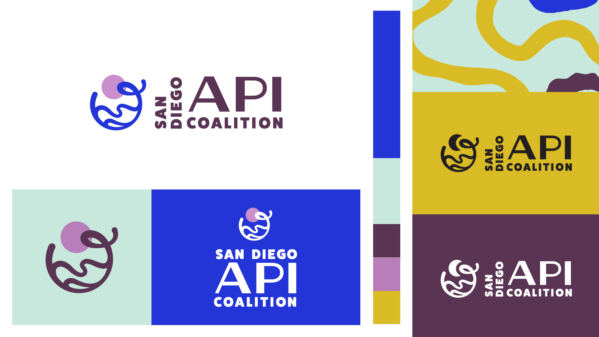
I proposed two branding directions and most Coalition members resonated with the water-inspired version. I wanted to push against the famous Bruce Lee quote to “be water,” or adapting to fill whatever container we find ourselves in. Instead, I hoped the logo would have a sense of expansiveness, allowing the container to be iterated upon and molded, not just accepted as it was. The waves and sun image are typical San Diego metaphors that the Coalition members gravitated towards, but also was an homage to the many Asian and Pacific Islander cultures with water and oceans as a central force.


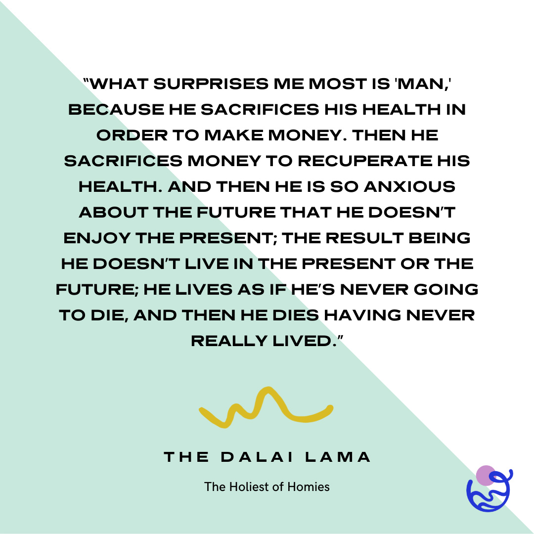
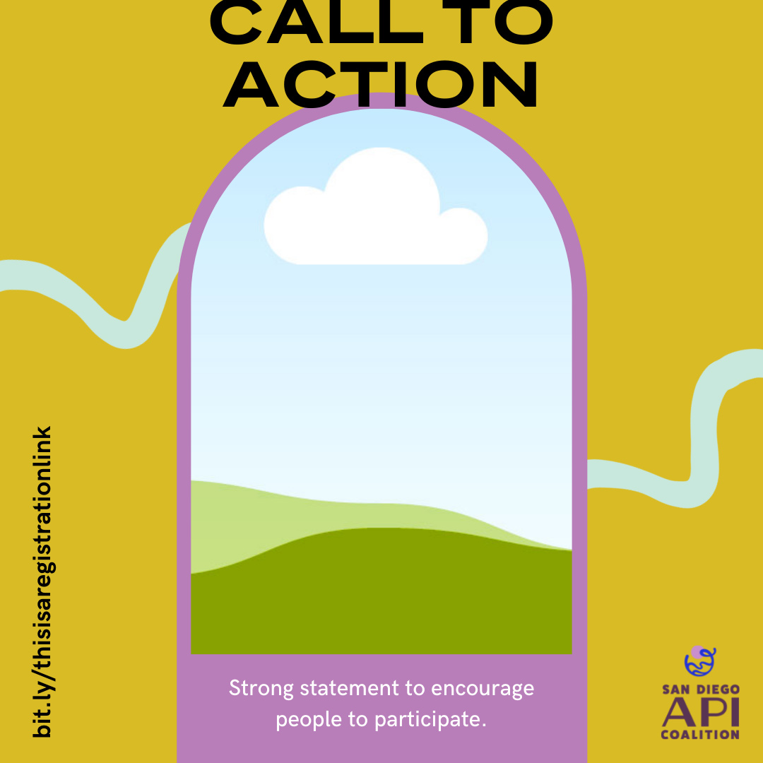
In addition to a style guide annotating font, color and logo usage, I created a template system in Canva to accommodate multiple instances of events, quotes, and calls to action (such as contacting City Council meetings).

