CPI Brand Kit
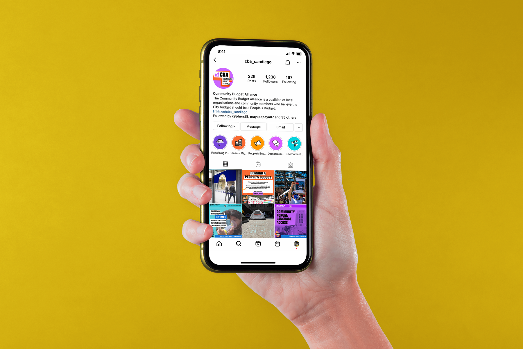
The Center on Policy Initiatives (CPI) is a nonprofit research and action institute focused on creating economic prosperity, sustainable communities, and a healthy environment for all. They provide the infrastructure for multiple community-led coalitions, including the Community Budget Alliance, organized to push for a San Diego city budget designed for the people.
Share

With a growing communications team, the CPI brand needed to be centralized (no more in-the-moment font choice decisions!). And with evolving roles in community coalitions, they wanted a brand system that could empower coalition members to create their own designs, while ensuring it would remain a part of CPI.

Project Planning and Proposal
With such an extensive goal in mind, we needed a project management approach that we could pace ourselves with. I outlined three phases of the project to make sure the branding guidelines proposed for CPI and its coalitions were long-term and accessible across multiple generations of staff, partners and employees. The phases took into account a need for initial brand alignment (1 Establish identity), the need for brand kits that were actually usable (2 Encourage communication), and a template system that functioned for everyone (3 Prepare for growth).

Brand Discovery
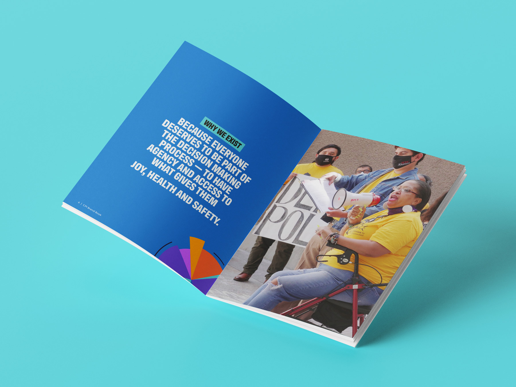
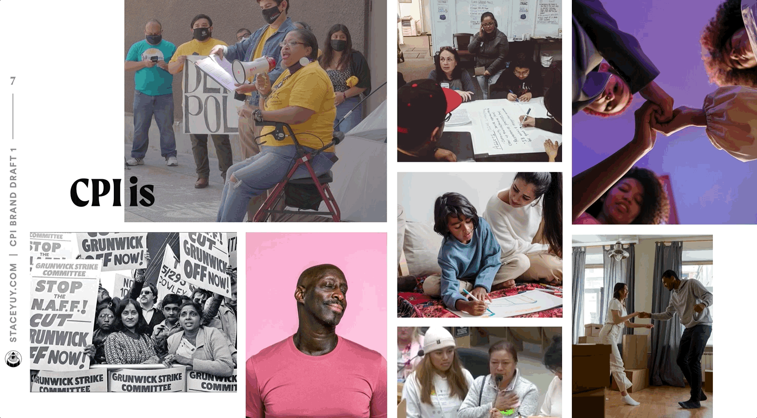
Within the first phase, I led a branding consultation via Miro to better understand who CPI was. I found they weren’t looking to change the CPI logo, but rather to create a personality that resonated with the many hats they wore. They saw low-wage workers as their core population, but as a policy and research organization they knew they also needed to get the attention of elected officials, young people, and those who didn’t see themselves as “activists” yet. During our “what, how, why” exercise, one “why” statement that surfaced was that,
Everyone deserves to be part of the decision making process.”
I knew that in order for CPI’s brand kit to be successful it had to be dynamic and eye-catching, but still reserved and approachable enough for less radical audiences to engage with.

After our consultation, I presented the results along with four suggested solutions for the struggles they were having:
- Create a font system that conveys courage, power, and charisma
- Expand the palette beyond two colors to incorporate joy and brightness
- Use patterns and illustrations to create more levers to play with and increase flexibility of the brand
- Utilize content buckets to streamline the process of uplifting both campaigns and the people behind them

I believe that clients need to see real world examples rather than simply imagining what a designer means. It fosters trust and alignment, so I created brand samples to illustrate each suggestion.
Brand Book Construction
After making a few adjustments to the brand additions, it was time to codify them into a brand book. I found that even in the designing of the brand book itself, I was able to confirm design strategies that would make the CPI brand its own, like color blocking and text highlights.
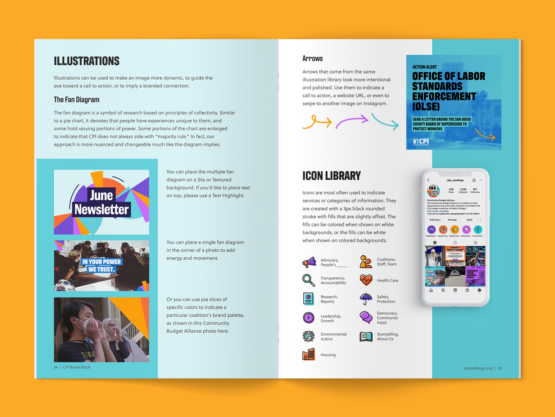
I provided illustration helpers like a small icon library with an expansive definition system and a Fan Diagram that could be used to liven backgrounds and photos.
The Fan Diagram is a symbol of research based on the principles of collectivity. Similar to a pie chart, it denotes that people have experiences unique to them, and some hold varying portions of power. Some portions of the chart are enlarged to indicate that CPI does not always side with ‘majority rule.’ In fact, our approach is more nuanced and changeable much like the diagram implies.”
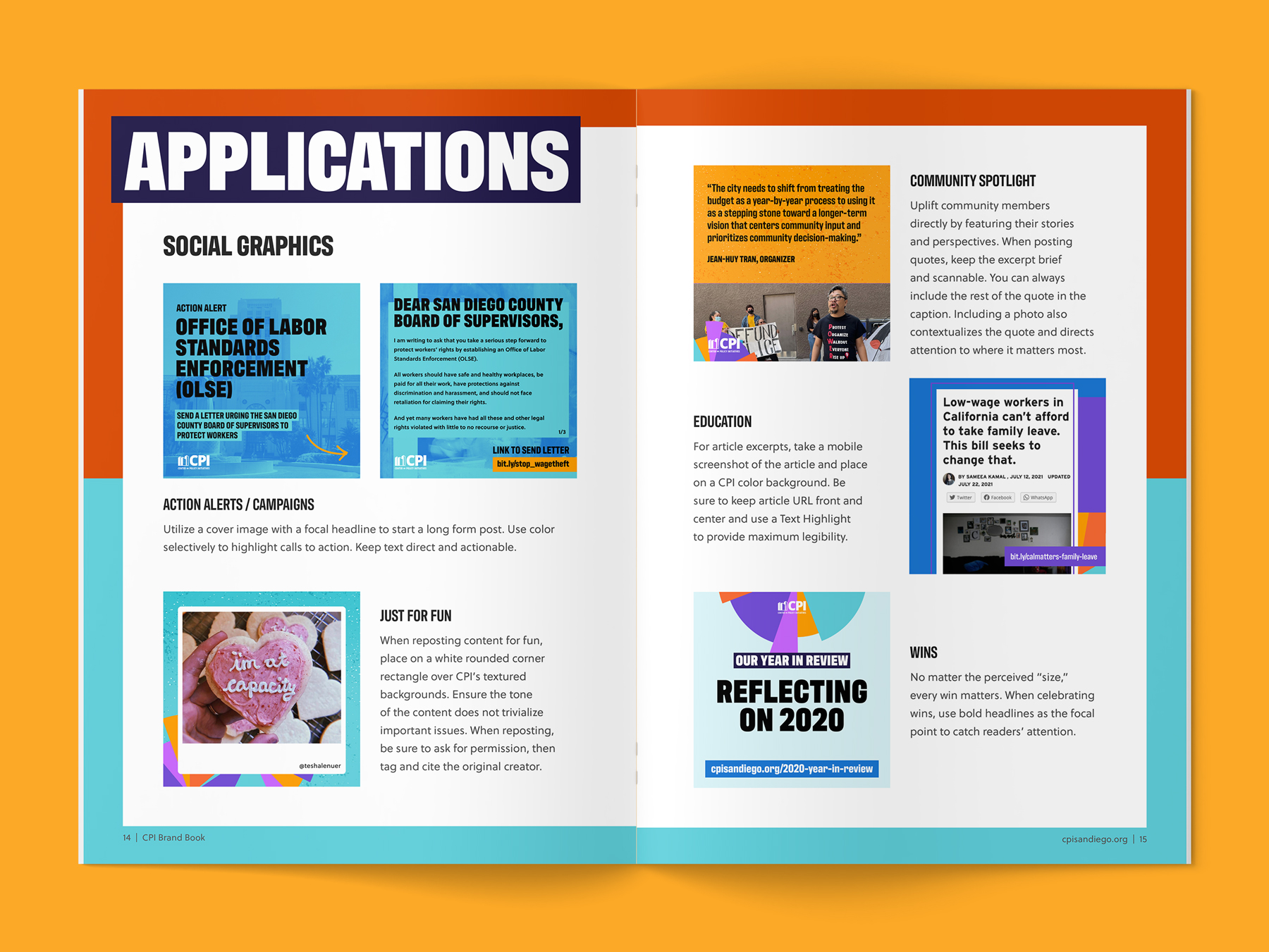
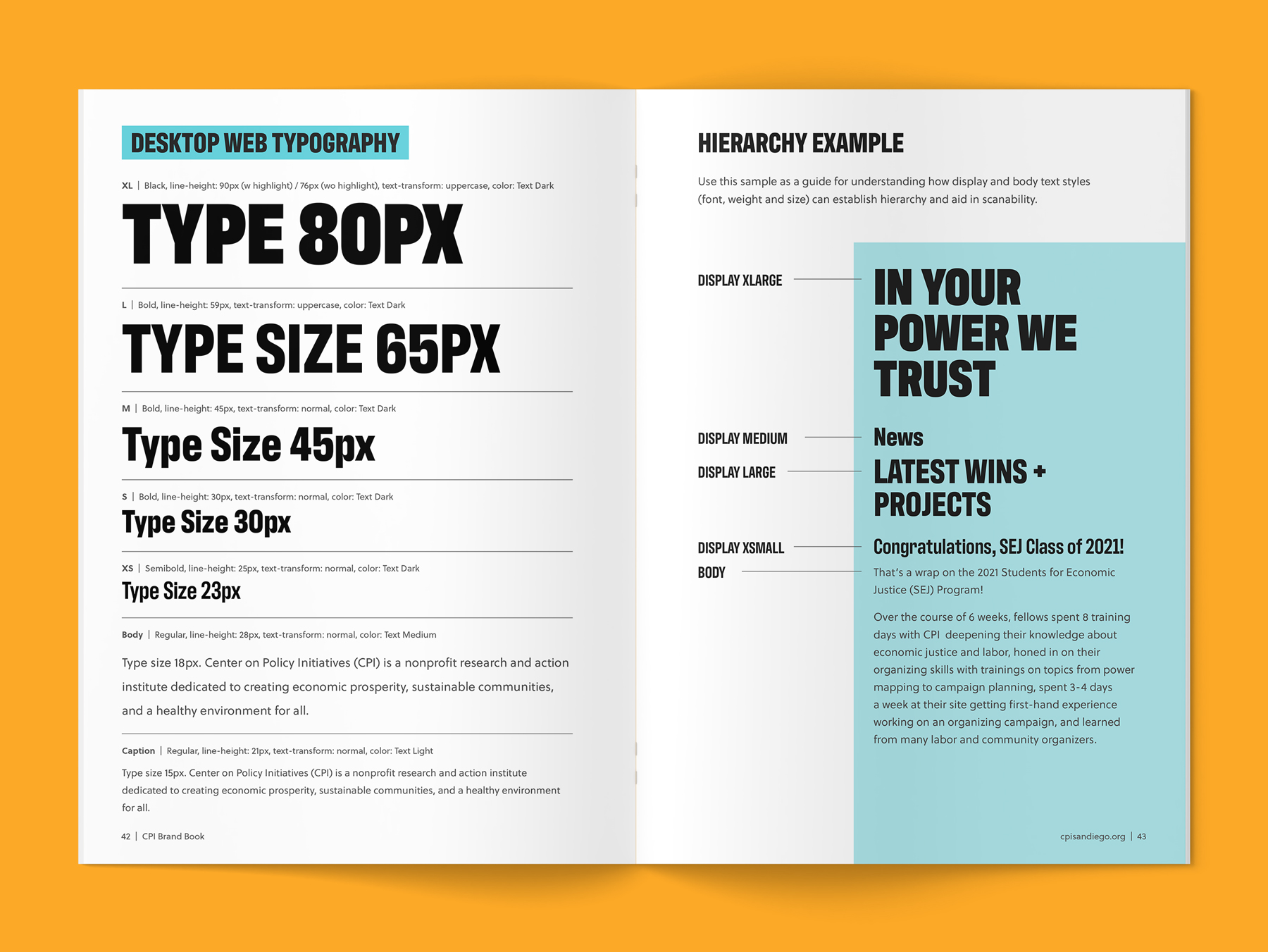
I also included typography hierarchy systems for desktop and mobile websites, letter-sized reports, and graphic images, along with basic tutorials on layout, photography use, and sub-brand logo creation for current and future coalitions.
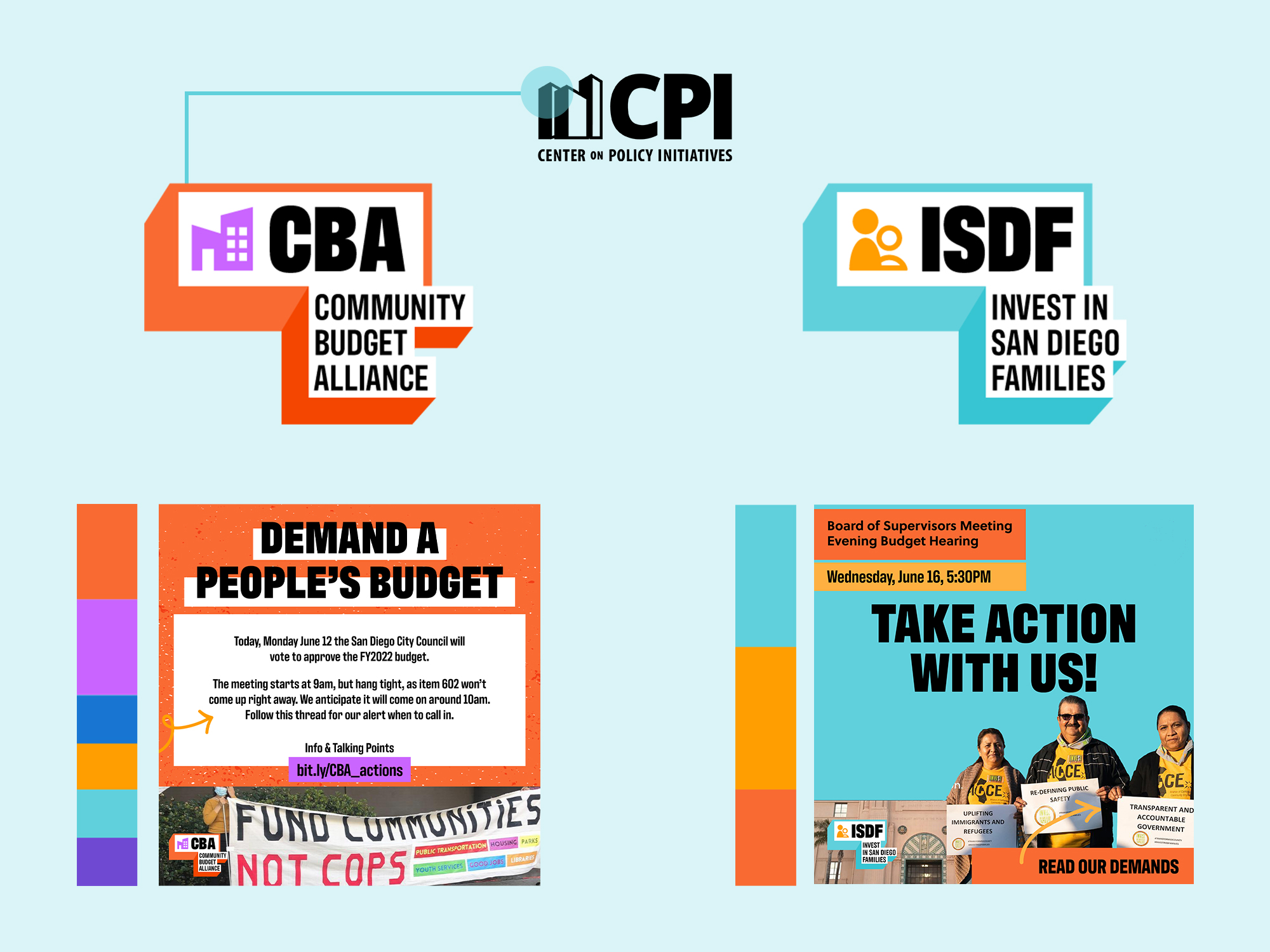
Sub-Brand Logos
In order to keep CPI self-sufficient, logos for coalitions had to be simple enough for a non designer to create. I used the three-dimensional shapes of the buildings in the CPI logo to create a frame for each coalition. They then follow a simple formula with an icon, the acronym written in the Antarctican Headline font, followed by the full coalition name written below. Each coalition would then have its own subset of the CPI color palette, designating a different color or set of colors as the primary palette.
The Full CPI Brand Book
Check out the final outcome below!