Mending Matters
Mending Matters is a San Diego-based nonprofit offering holistic mental health services on high school campuses.
Share


A unique story needs a unique brand.
Mending Matters had a clear, driven vision for what they wanted their organization to be. All they needed was someone to communicate that vision in their brand. Their current logo was hand drawn, and while personal, it did not stand out amongst traditional nonprofit logos. Nonprofits often make the mistake of creating overly detailed logos not optimized to capture someone’s attention. I wanted to show them the possibilities by comparing them to modern, young nonprofit organizations.
A few sketches later.
Mending Matters believes that all young people deserve mental health services and the best way to do that is to meet students where they are. Their brand had to be relatable and human. I knew I wanted some aspect of the logo to be hand drawn, to speak to the imperfections and personality of being human and vulnerable. I also wanted to utilize a speech bubble as the basis of their icon to represent the organization’s focus on communication and dialogue. It all came together with the interlocked “M” icon, showing two parts becoming a whole in a strong, solid foundation.
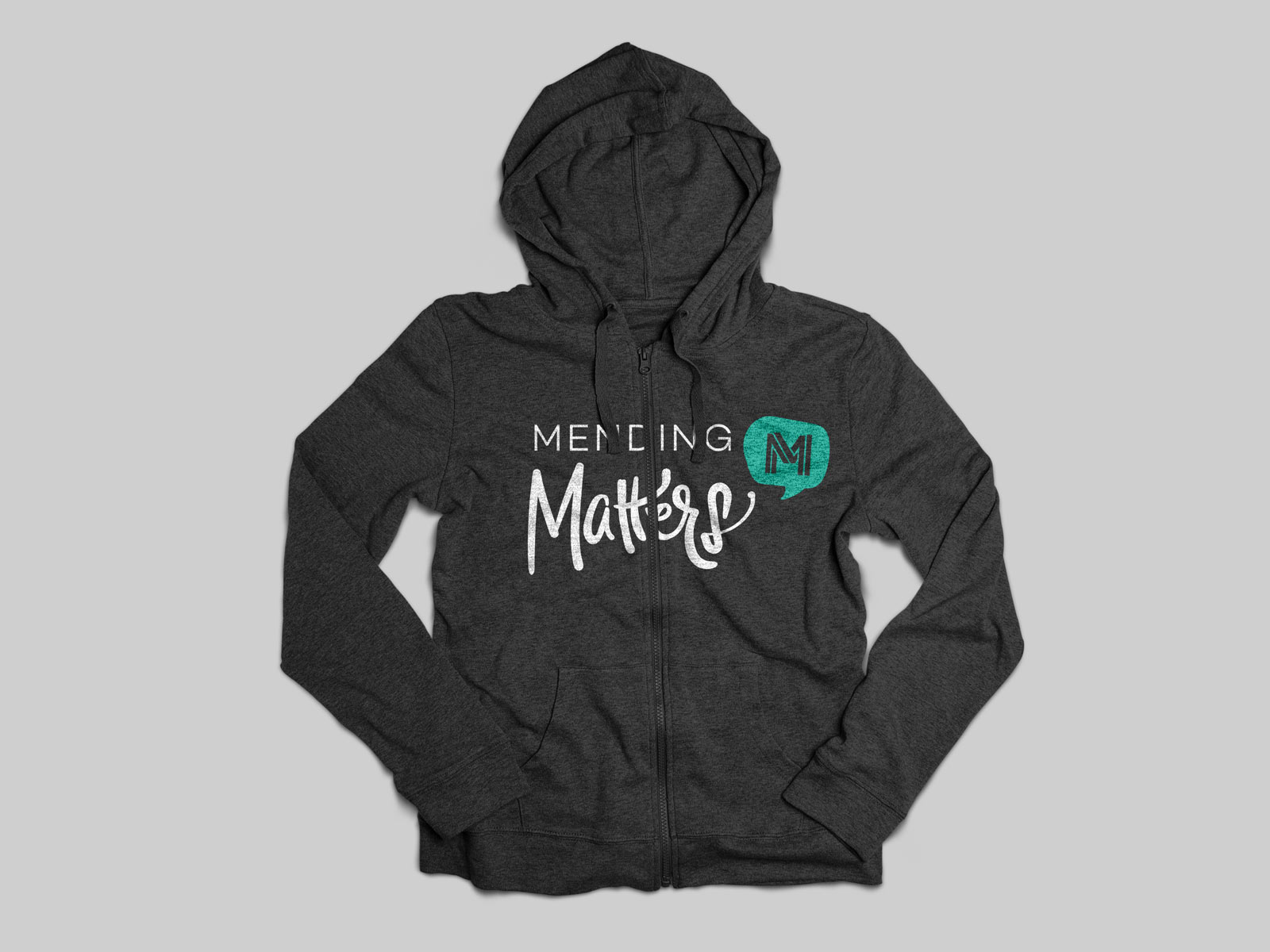
Additional media.
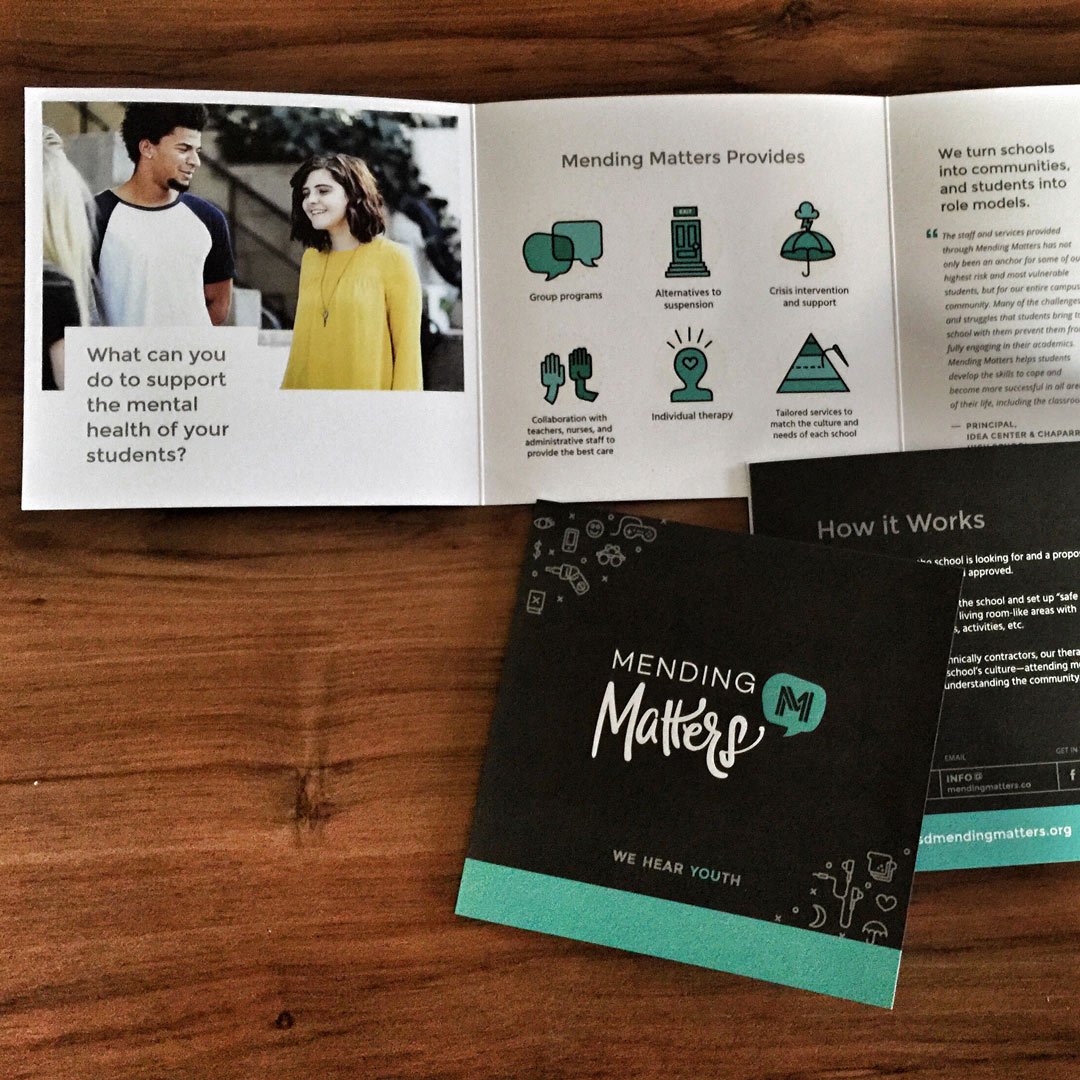
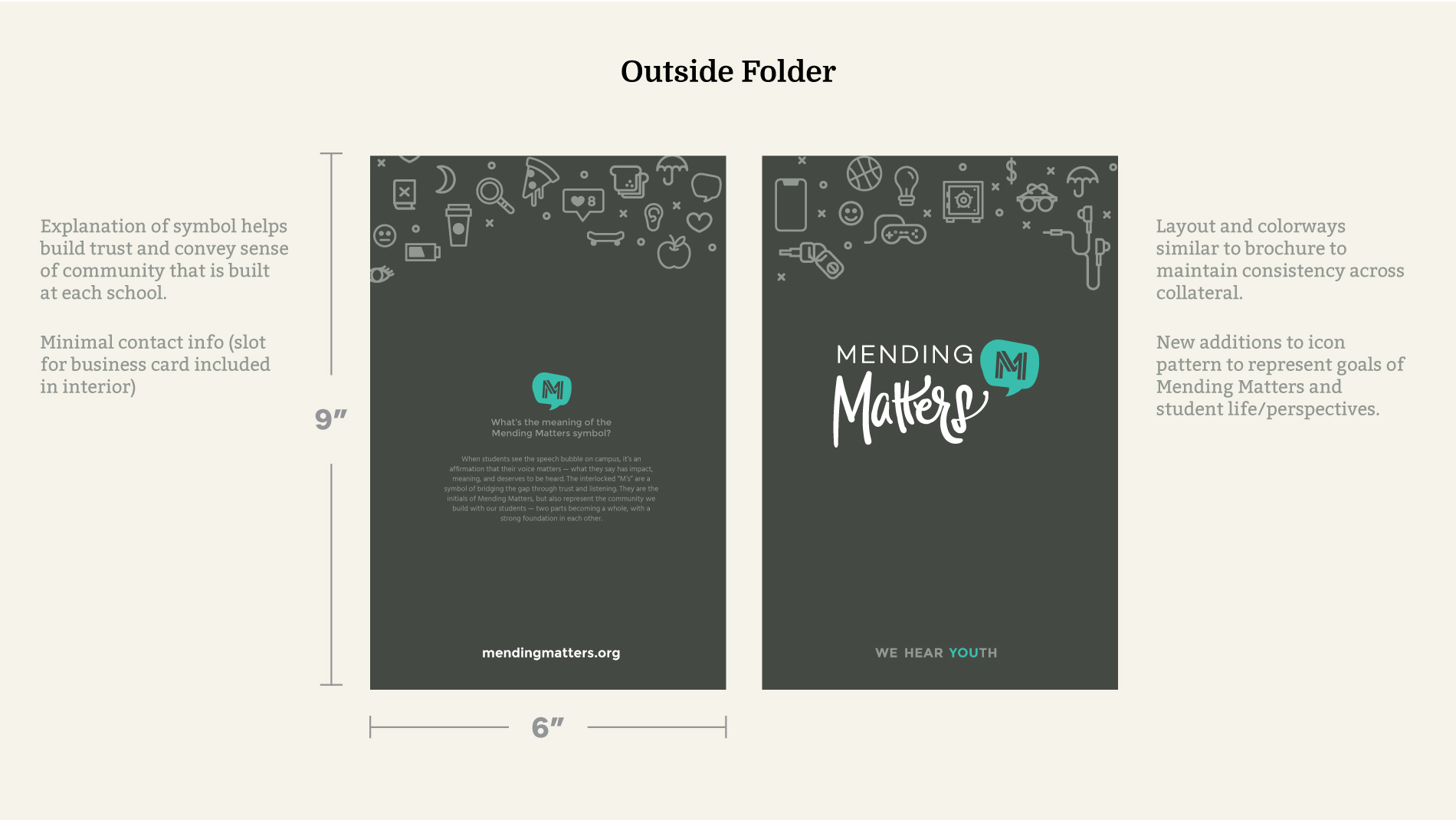
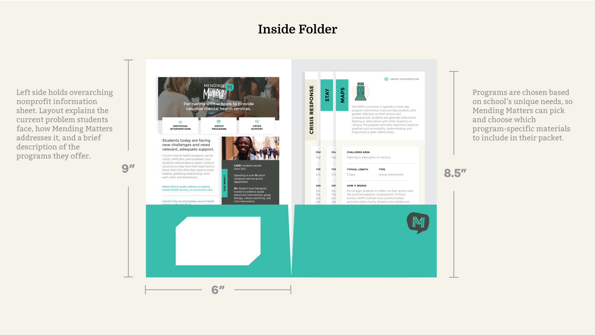
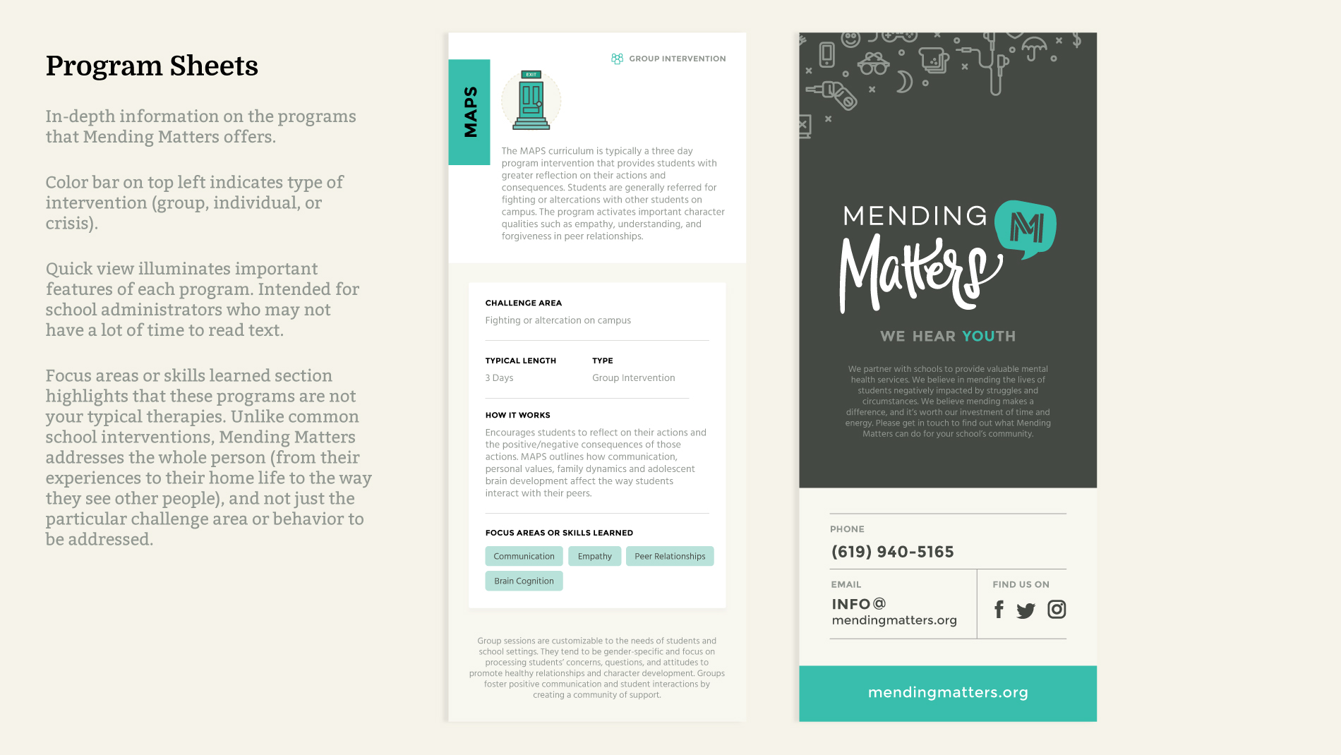
Once Mending Matters was ready to take on more schools, they needed a piece of collateral to leave an impression on the administrators they were meeting. Again, I took a “less is more” approach and provided a short introduction to their services, the results they were driving, and some social proof testimonials. Print collateral should be an elevator pitch, leaving readers wanting to know more by contacting the organization.
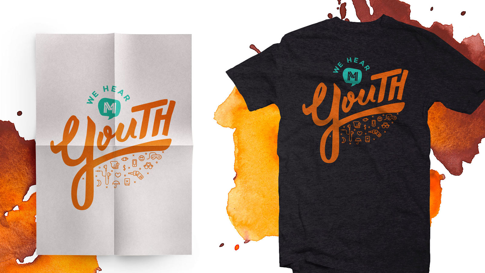
I also introduced a secondary color palette and design for their “We Hear YOUth” campaign.
Services provided:
- Branding
- Promotional brochure
- Merchandise
- Campaign design