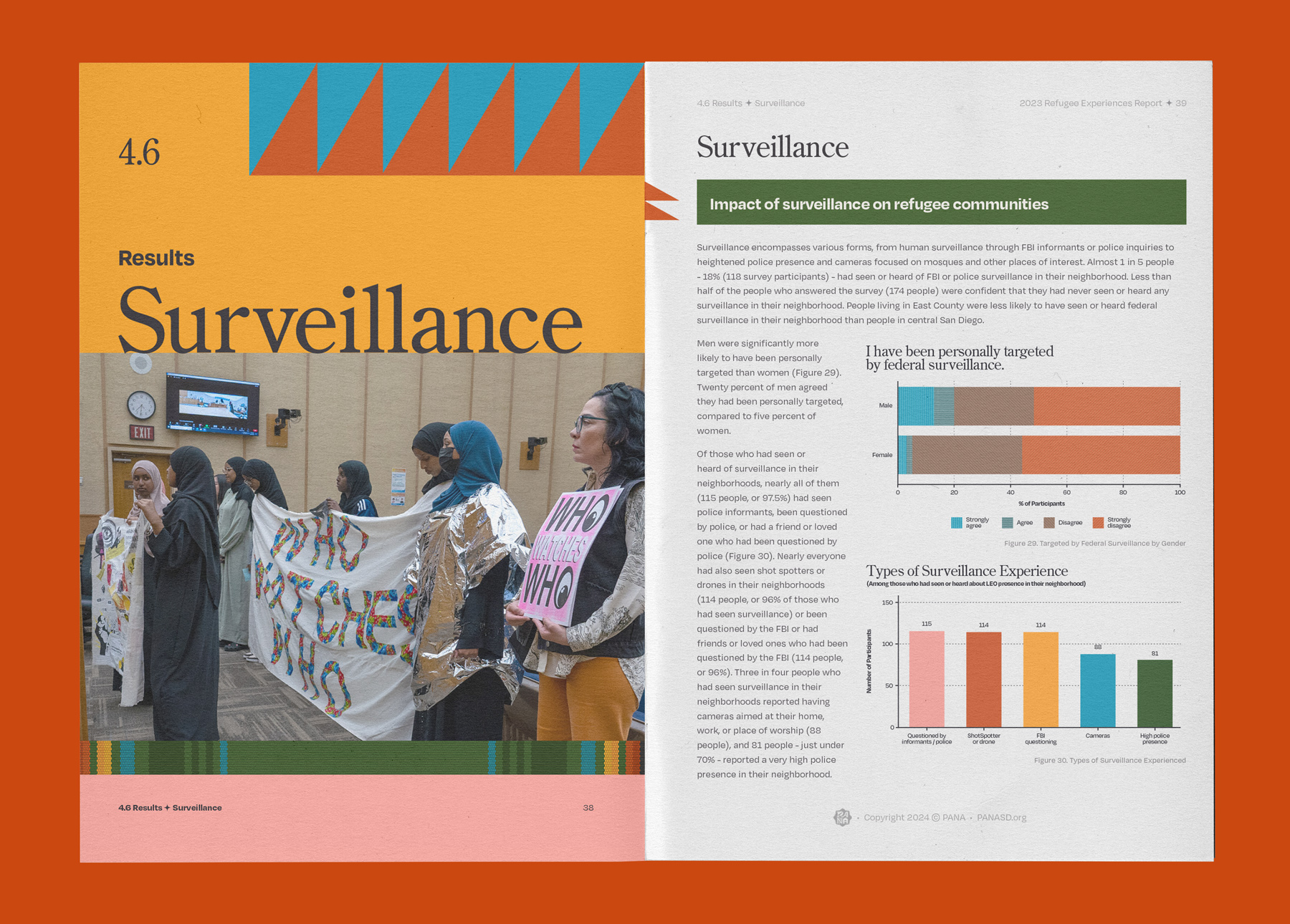
As PANA neared its 10th anniversary of organizing refugee and immigrant power in 2025, they set out to build a rebrand that reflected their excitement and ambition. Their previous brand had taken them far — growing to a a full team, winning tenant protections for refugee families, and training community members to lead in grassroots organizing. It was time for their brand to encapsulate the energy, momentum, and style they bring to their work everyday.
Brand Discovery.
Through the brand discovery consultation, we learned that there was a clear vision for who PANA is and what makes PANA unique, which is a really special thing that not a lot of organizations possess. In the end, we uncovered a few challenges:
- How do we build a brand that’s intuitive, bold, welcoming, authentic, accountable and compassionate?
- How much importance do we put on the perceptions of risk-adverse funders and lawmakers knowing the transformational shifts and courage needed to win?
- How do we walk into the room powerfully without conforming to the establishment’s expectations of what power looks like?
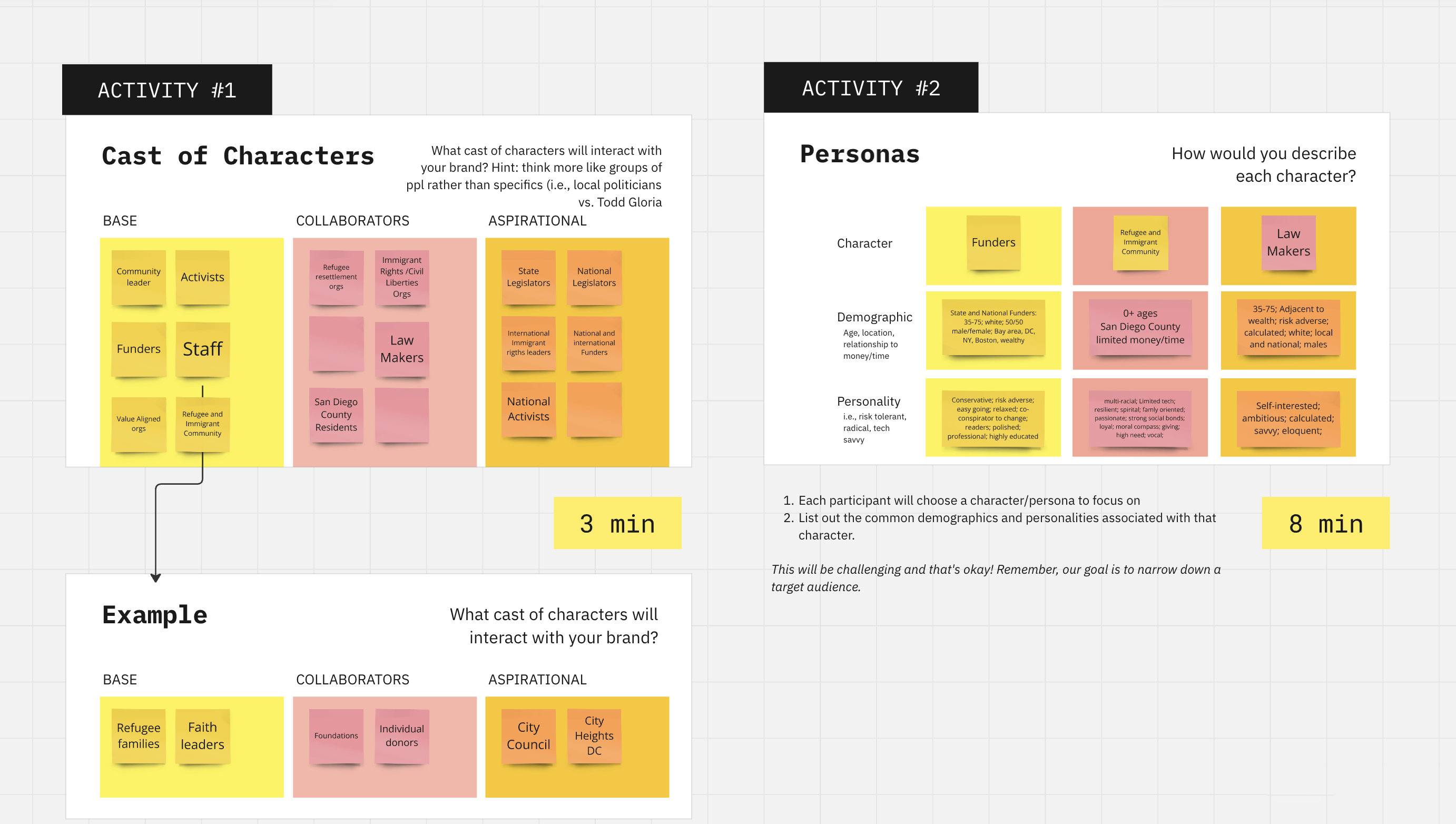
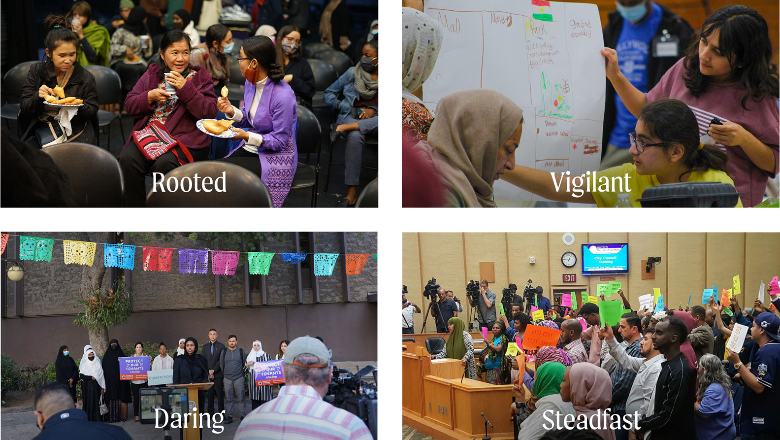
In order to guide the brand process, we identified four key personality traits that the new brand needed to exemplify.
Rooted. PANA is always coming back to the communities they represent and fighting to make a home when our homelands are out of reach.
Vigilant. PANA looks to the community to determine the next steps. They keep watch over what our politicians do and inform the people of when accountability is needed.
Daring. PANA breaks the mold of the model minority myth, refusing to accept oppression quietly, and daring to believe that something bigger and better for us is possible.
Steadfast. PANA remains firmly committed to community values despite the challenges and oppression they face.
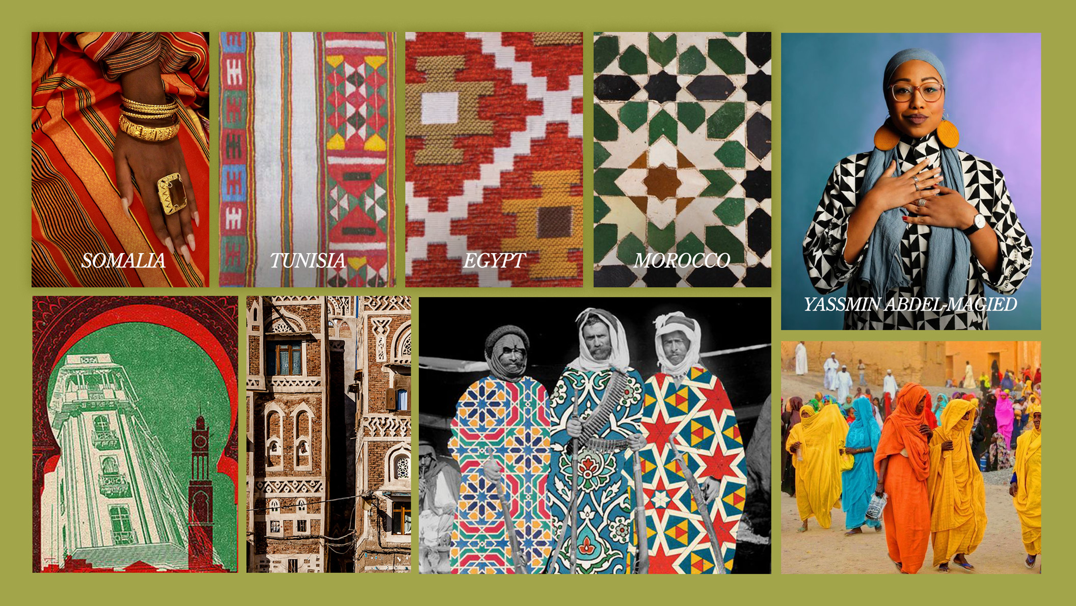
Mood Board.
The rebrand took root in patterns and textiles that represented PANA’s community members. The repeating and buildable shapes depend on each other to support the whole, just like the people that make up PANA. The patterns were also representations of trade and cultural exchange, such as the alindi cloth from Somalia, which often uses Somali native plants and dyes from India and Pakistan.
Yassmin Abdel-Magied, an activist and writer born in Sudan and raised in Australia, was also a source of inspiration for her article, “I Tried to Fight Racism by Being a ‘Model Minority’ — and Then It Backfired” in Teen Vogue. Abdel-Magied discusses how her views on the model minority myth changed when it no longer protected her as a Black Muslim woman criticizing imperialism. As an organization run mostly by Black women and women of color, the PANA team recounted similar struggles to be seen as powerful, and we hoped this rebrand would help them achieve that without needing to succumb to the mainstream’s limiting portraits of what power looks like.
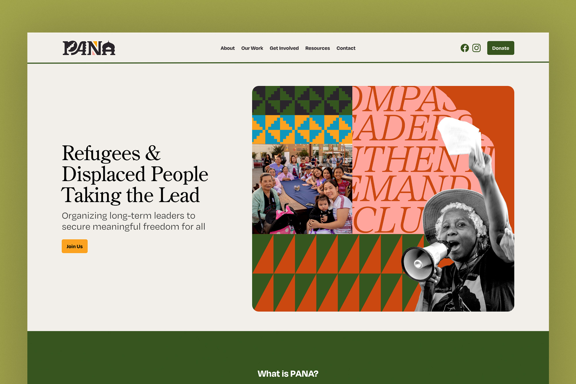
The Rebrand.
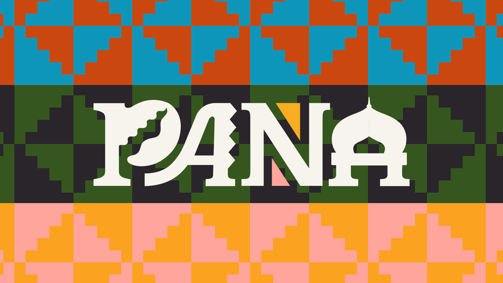
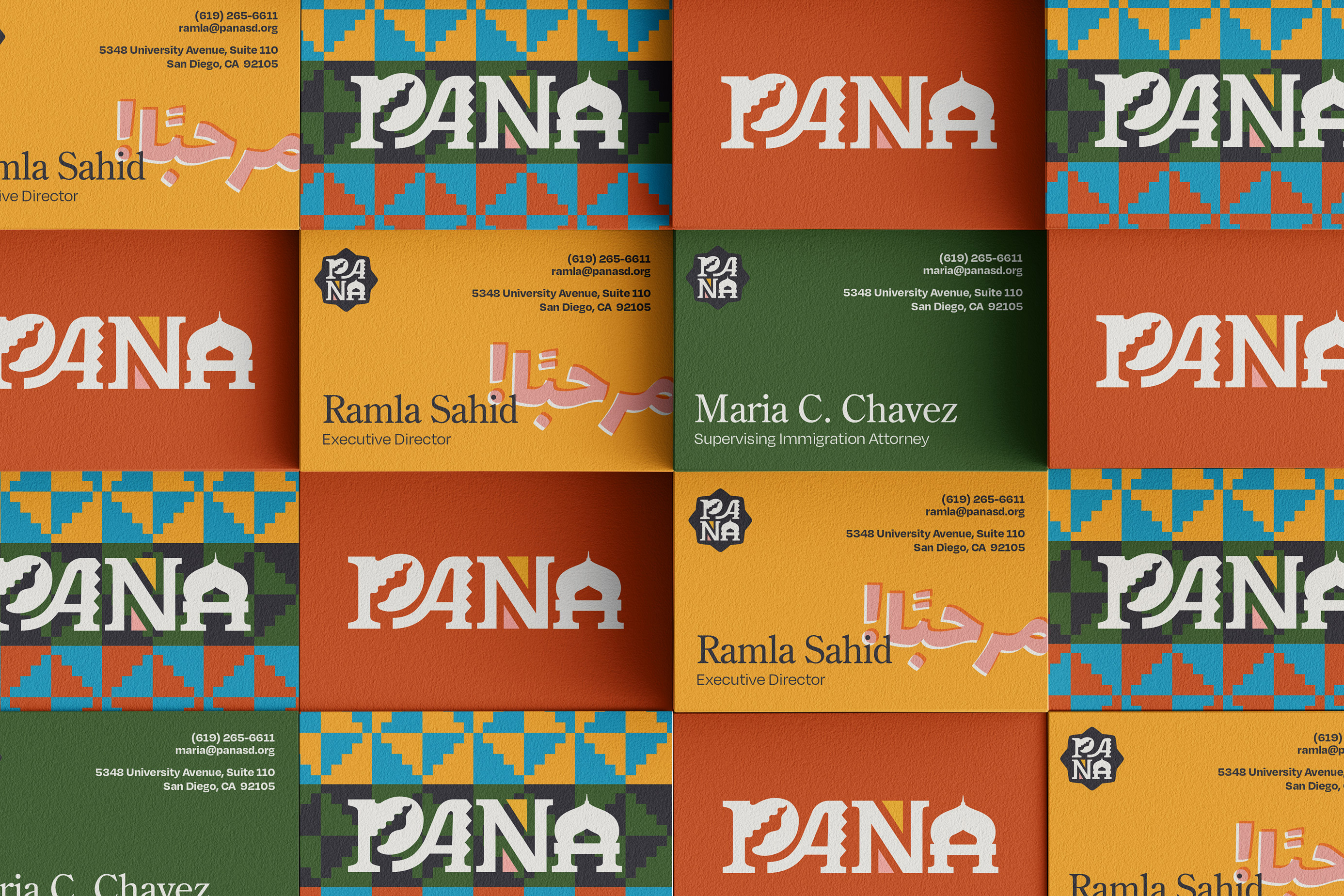
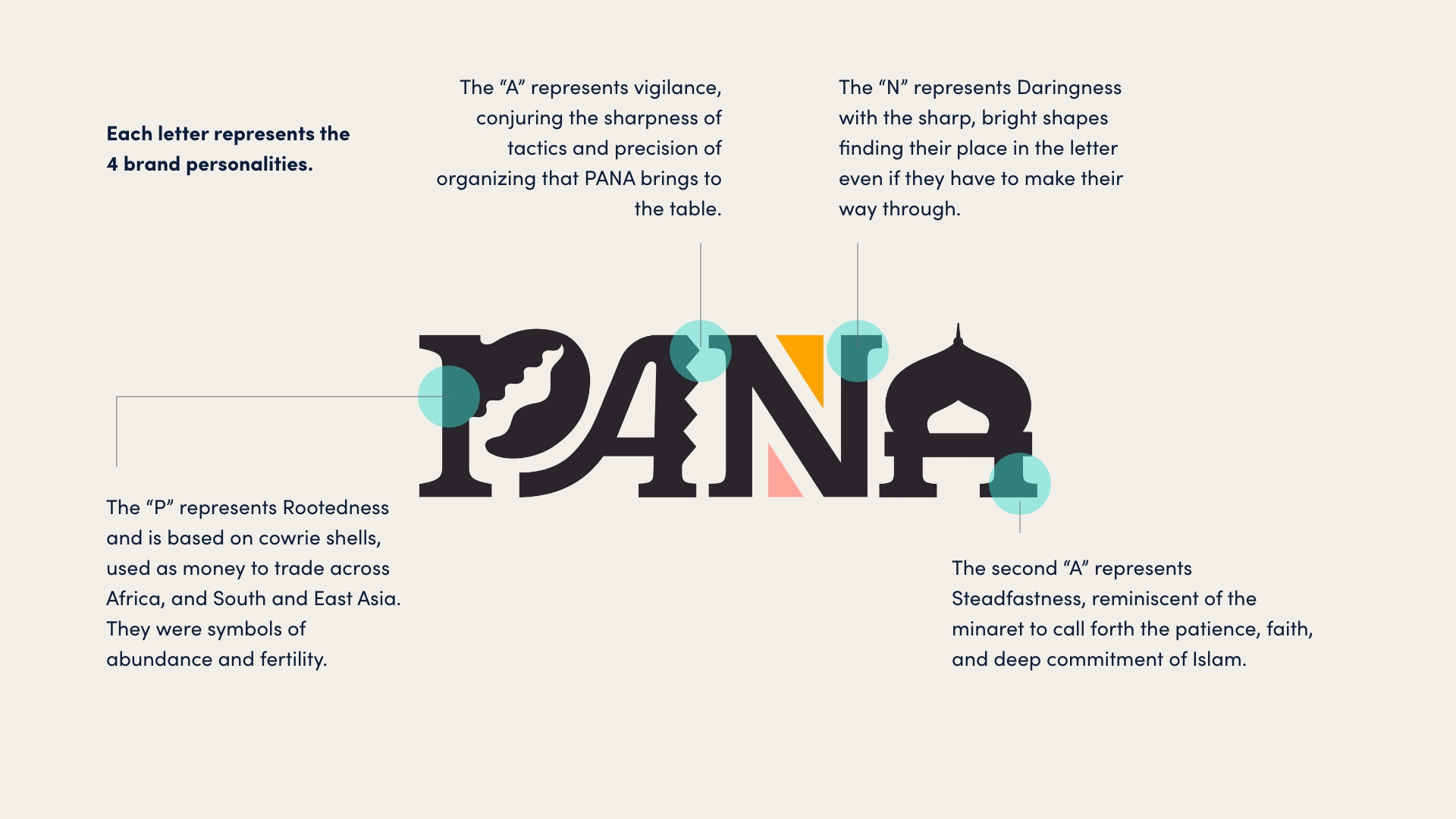
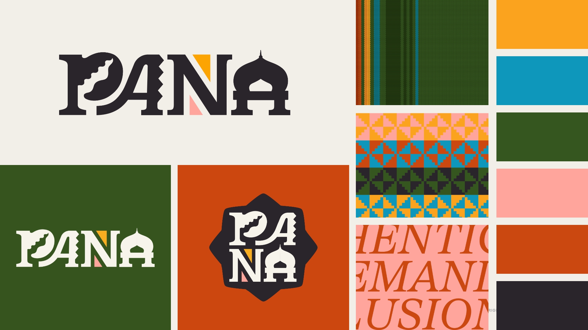
The new logo is meant to be eclectic and joyful with each letter representing the four brand personalities. The “P,” representing rootedness, resembles a cowrie shell, used as money to trade across all of Africa and South and East Asia. The jagged edge of the “A,” embodies vigilance and the sharpness of tactics that PANA brings to its organizing culture. The “N” represents daringness with sharp, bright shapes wedging their place inside the letter. And the last “A” represents steadfastness, taking the shape of a minaret to call forth the patience, faith, and deep commitment of Islam. The icon version of the logo is also representative of Islam, similar to tiles and window shapes found in mosques.
A set of custom patterns was made based on the alindi cloth, repeating flowers of North African tiles, and a windmill pattern inspired by the spiral woven baskets of Ethiopia. We also used text as a pattern to subtly reference their core values.
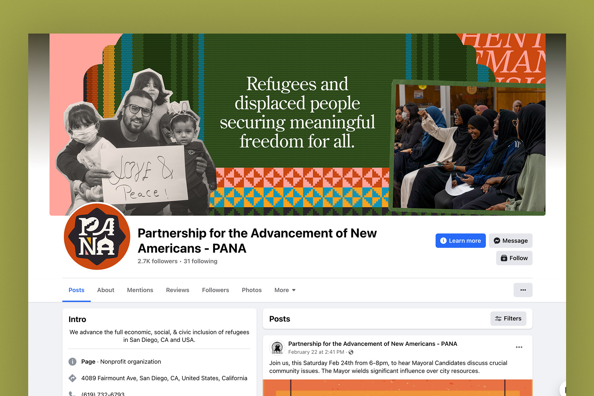
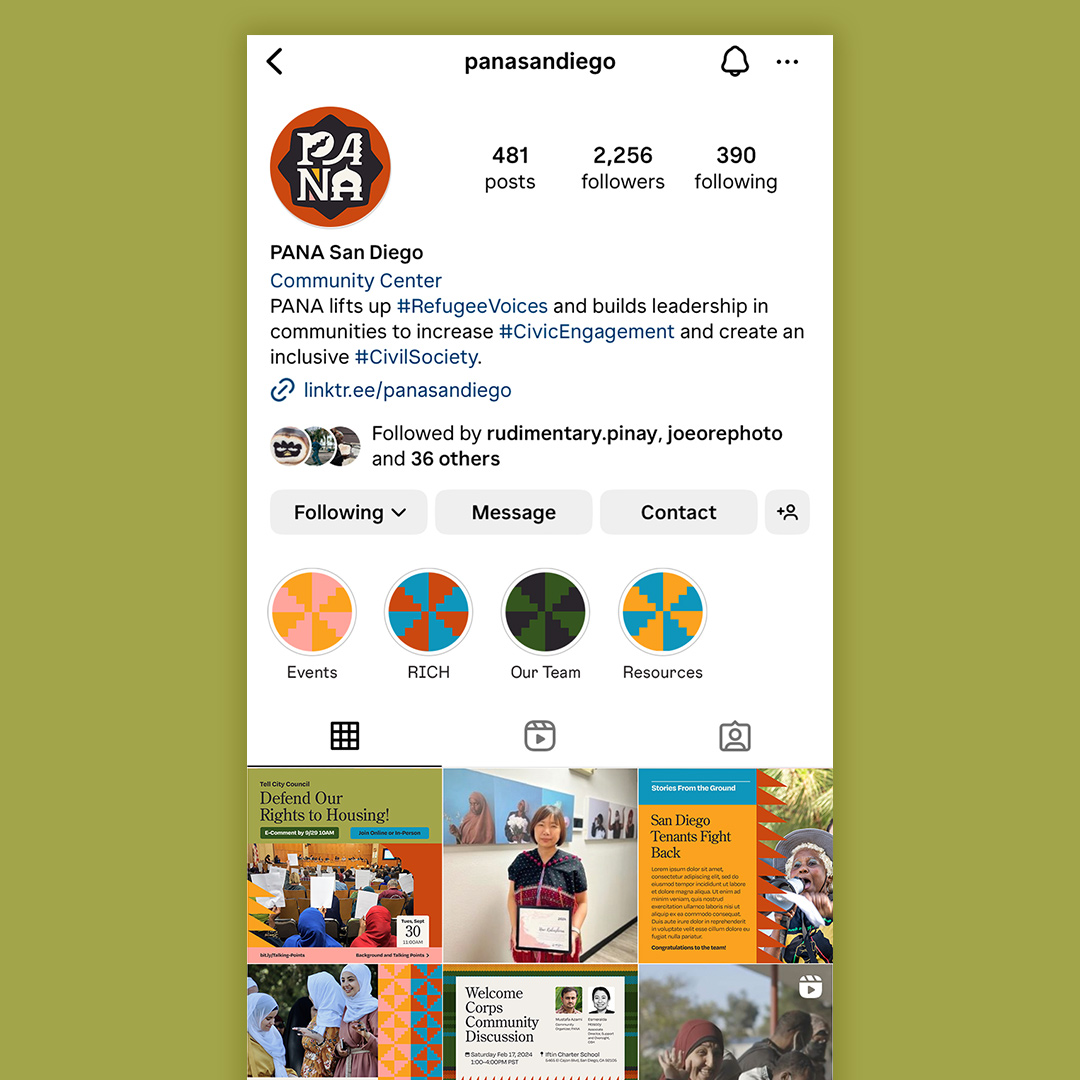
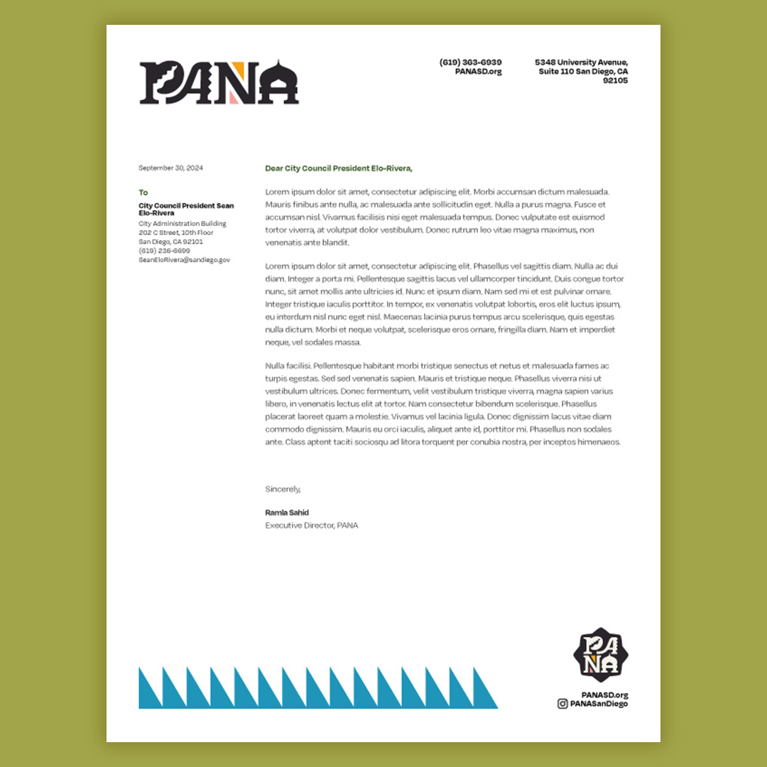
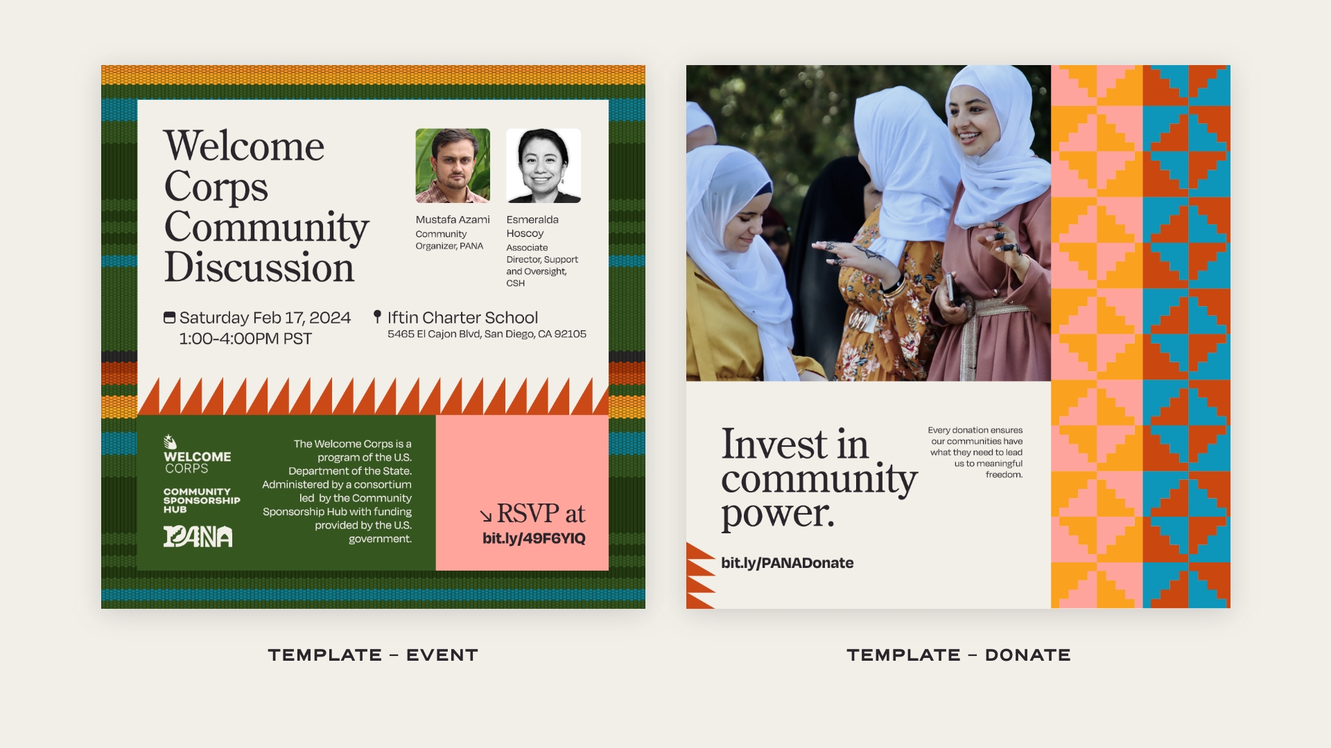
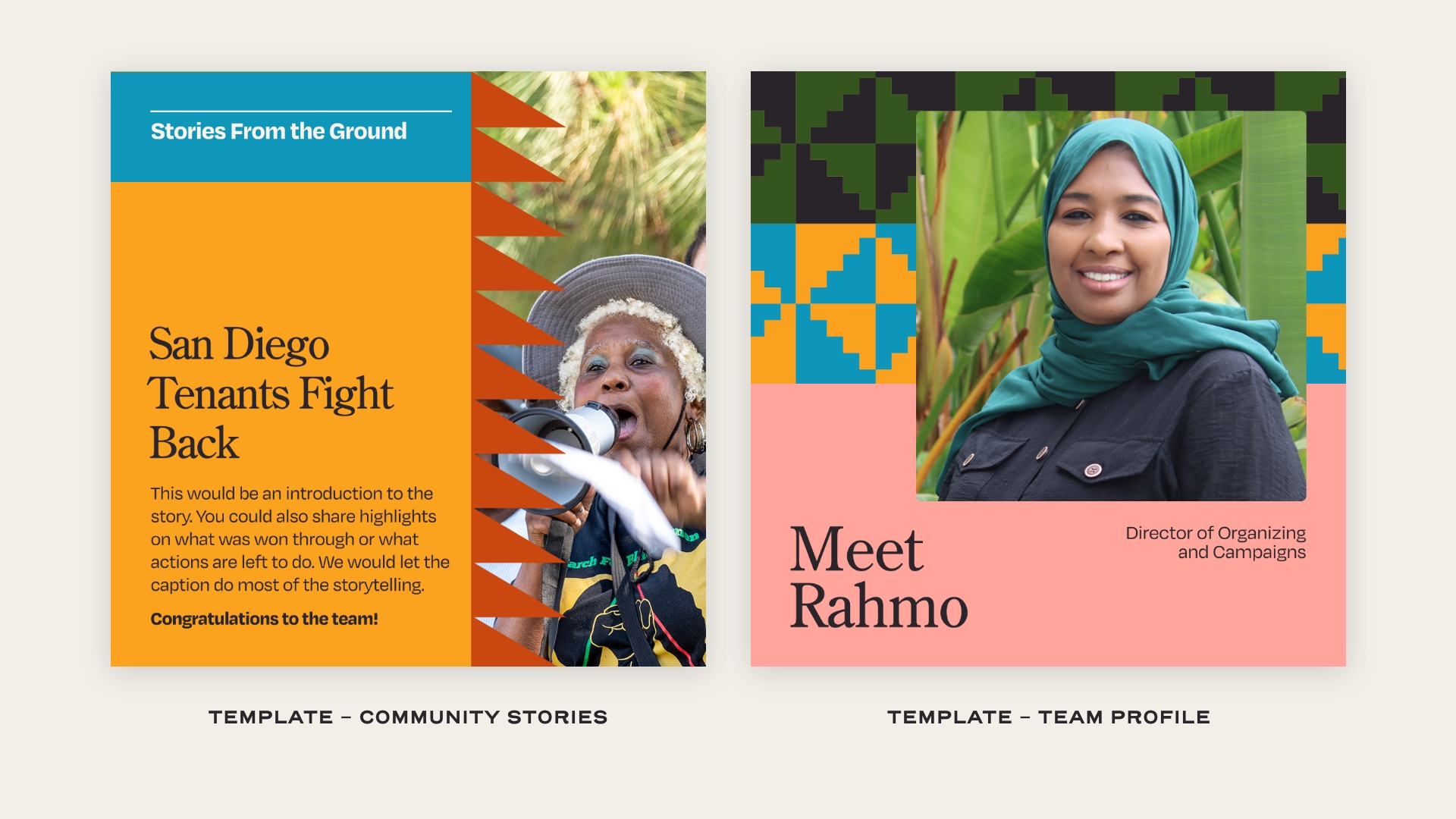
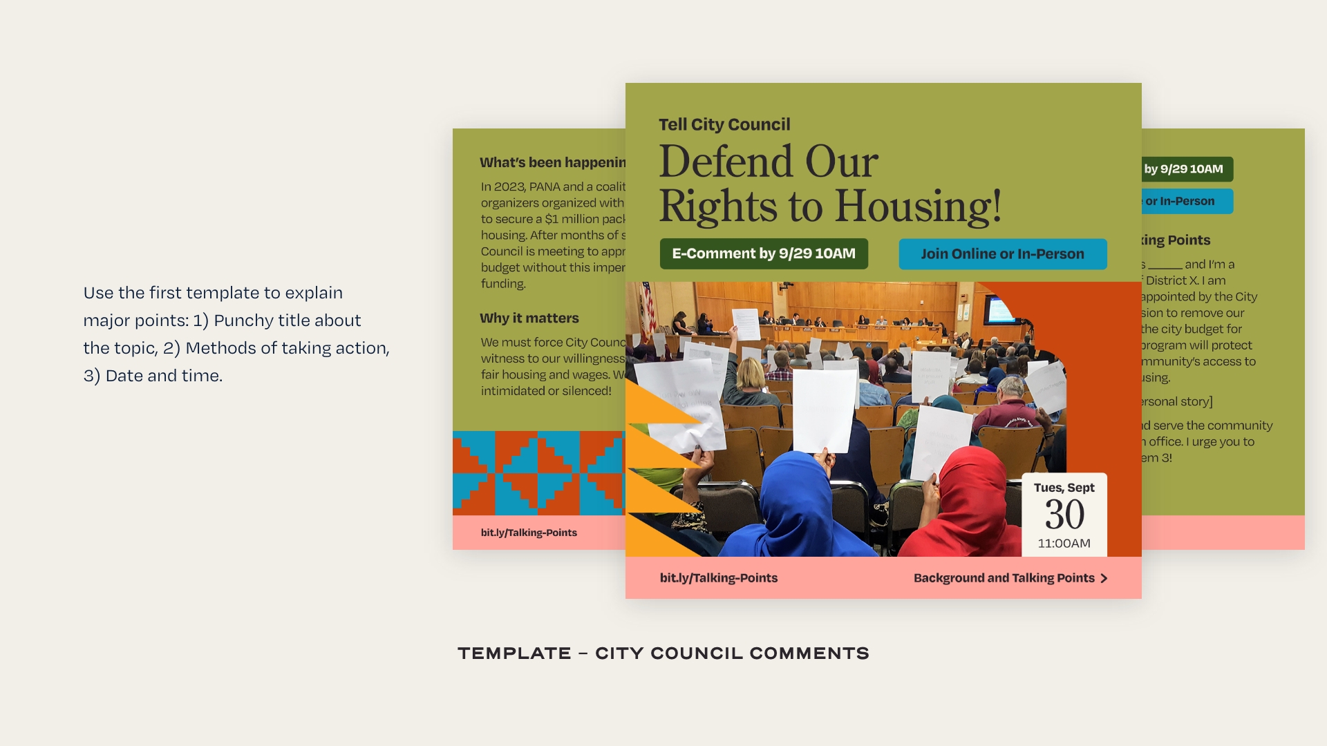
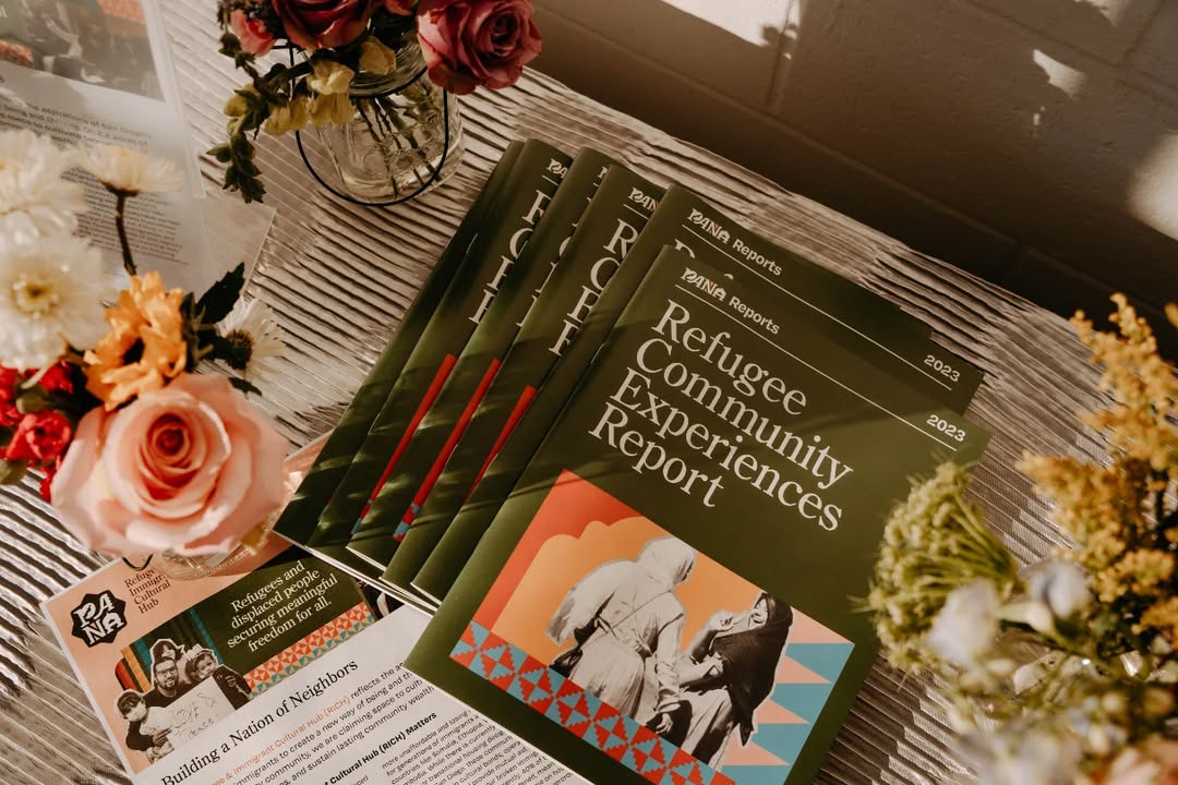
Photo Credit: Terry / AjA Project / PANA
