A New Look for South Park
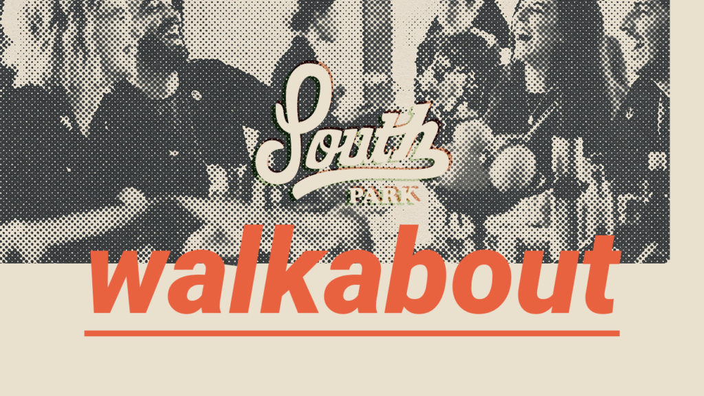
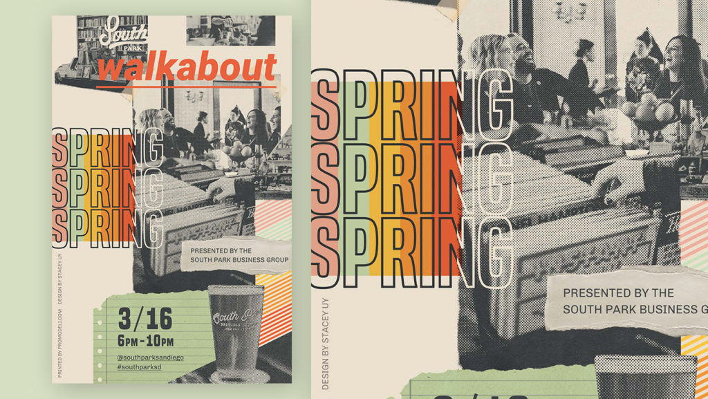
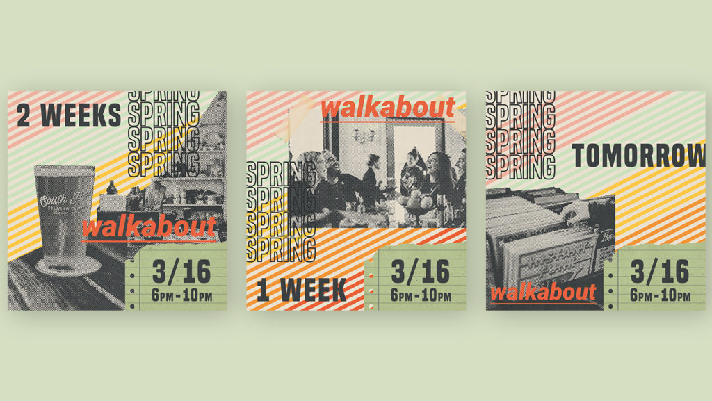
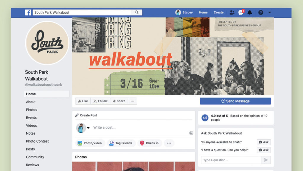
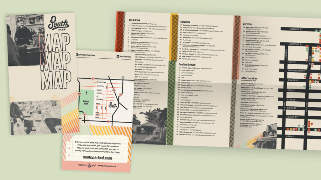
In 2019, neighborhood businesses had grown and matured as South Park drew larger crowds. We decided to rely more on photography and collage to modernize the look and to help visitors better visualize the event. Photos were given a halftone treatment to keep in line with the gritty character of the neighborhood.
Collage and Typography
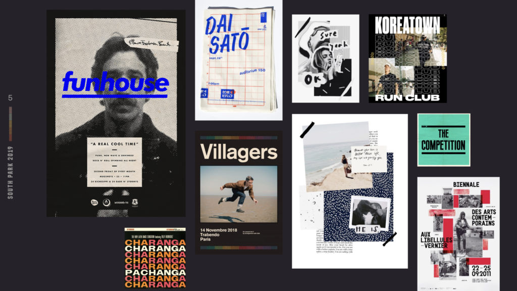
We drew inspiration from artwork collages, using typography as a pattern. By restricting the design to classic and somewhat plain typography, I made sure that the information didn’t get lost amongst the gritty textures and layers. Because the Walkabout isn’t just about one thing, the collage gave us an opportunity to highlight retailers, restaurants, and bars.
I started with a mockup using stock images for the group to approve the concept. I then worked with photographer Alexis Asquith of Hale Production Studios to conjure up a shot list that would last us all year. Her beautiful work in capturing the feeling of South Park made the final product possible. Once we had photos that captured the neighborhood, it just became a matter of arranging the pieces to convey what a night in South Park might feel like.
Services provided:
- Branding
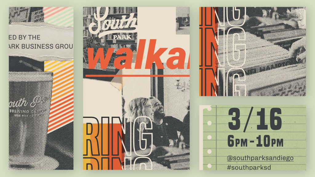
- Promotional flyer and poster
- Social media
- Wayfinding and map
