Hailey Mitsui
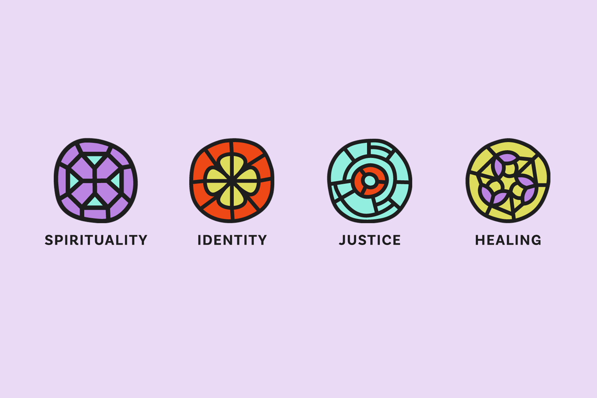
Hailey Mitsui is a Spiritual Director and Embodiment Coach working at the intersection of spirituality, identity, justice and healing.
Share

A Brand Both Hopeful and Honest.
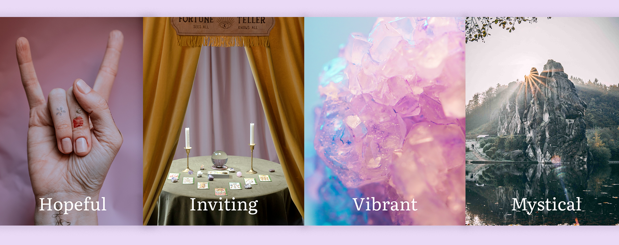
Hailey creates healing spaces for women and non-binary people of color to process the pain of transitioning out of organized religion and other toxic environments. She brings her own experiences of loss, grief, and joy, and needed a brand to reflect a variety of emotions, while holding out hope and possibility for a relationship with the Divine. As a former Christian who experienced these kinds of wounds as a youth, I felt personally called to bring a sense of hope and joy to this process. Based on our brand consultation, I named four adjectives that would guide the brand. It needed to be “hopeful,” as in being able to see the outcomes despite the pain; “Inviting” since most of Hailey’s clients had been rejected in some way; “Vibrant” because healing from trauma can be heavy and we needed to remind people of the joy and energy involved; and finally, “mystical” to inspire a sense of wonder and belief in something bigger than ourselves.
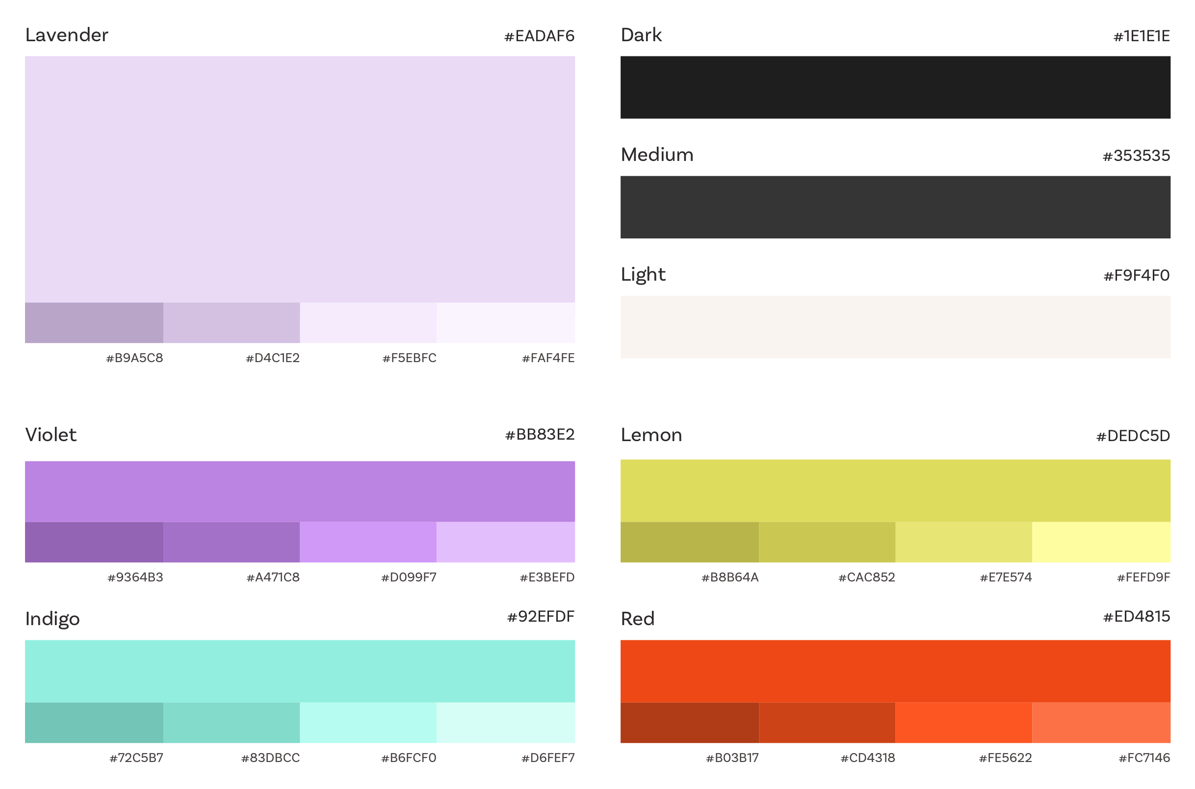
The mood board reflected the warmth and brightness of nature, the earthy messiness of contemplative environments and a little kookiness to get us through the day. One strong visual guide was the International Church of Cannabis in Denver, which covered a former Lutheran Church with rainbow murals and bright tapestries. This idea of reclaiming the stoic and sanitized church environment to reflect the joy and hope of the people gathered within it influenced the branding journey heavily. We also brought in the concept of kintsugi to honor Hailey’s Japanese heritage. Kintsugi is the practice of fixing broken pieces with gold to honor something once broken and held together again.

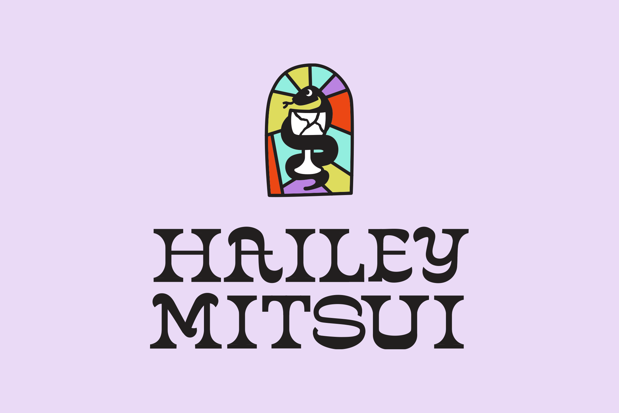
Reclaiming Spiritual Iconography.
Finally! Being raised Catholic benefits me in some way. I wanted to use the deep symbolism of religious iconography, but repurpose them according to Hailey’s approach to healing. The logo is built around a snake, which is correlated with evil by Christianity, but is actually a symbol of rebirth and femininity in most non-Christian contexts. The snake wraps tightly around a sacramental glass to symbolize the tension of sitting with the pain to make room for healing. The glass, representing the prescribed guilt of the Last Supper sacrifice narrative, is broken and put together again through the Japanese art of kintsugi. The snake icon appears on a pane of stained glass, historically a tool to educate non-literate church attendees. Here it is a symbol of hope and wonder. The custom typeface was meant to feel fun, vibrant and hieroglyphic-like. A whimsical mysticism is created by combining swooping swashes and structured serifs.
I had a lot of fun creating multiple variations of the logo so that Hailey had the flexibility to use her brand in different contexts.
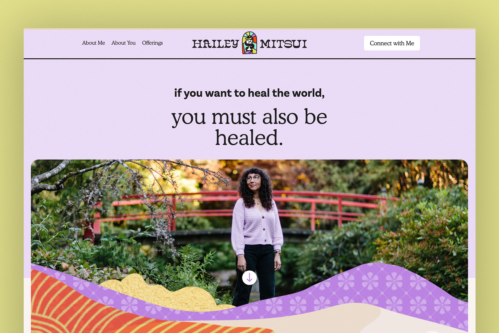
A Custom and Editable Website.
Using Webflow, I made a fully custom website for Hailey, while giving her a personal editor to make surface changes such as copy, images, service offerings. The website needed to be easy to navigate while weaving in Hailey’s unique approach as a Spiritual Director and Embodiment Coach. While the homepage introduces Hailey’s work and affirms visitors’ mindsets for being there, I created a simple navigation with the options: About Me, About You, and Offerings. The Offerings page is setup as a collection in Webflow allowing Hailey to add services as her practice grows.

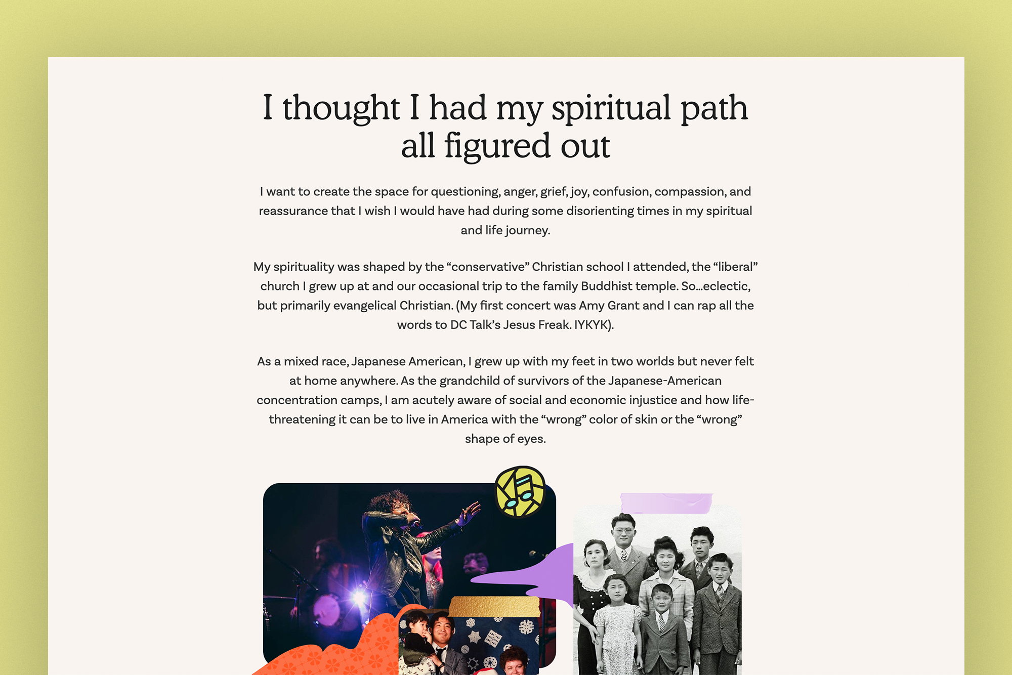
Mini Collages and Iconography.
I created mini collages throughout the website to incorporate a sense of whimsy and spontaneity. I used washi tape to “paste” photos together and mimicked kintsugi patterns as cut outs of some photos.
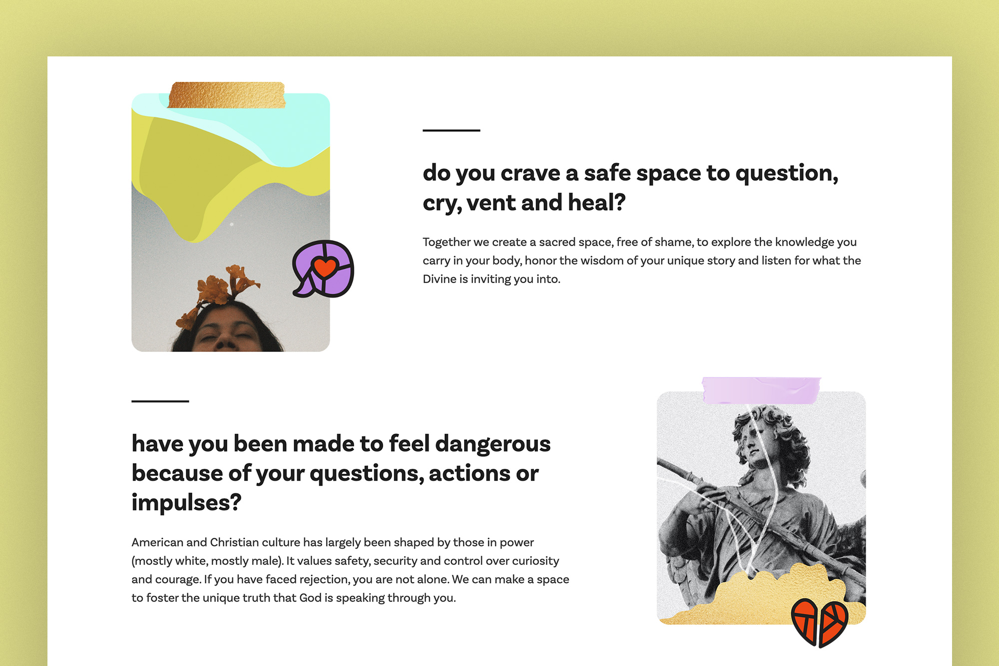
The iconography was also based on stained glass window motifs, but I used heavy lines and slightly warped shapes more reminiscent of woodcut printing.
Transferring Brand Ownership.
As a brand designer, it’s important to me that the brand doesn’t live and die within my project timeline. A good brand is one that continues to live and define itself in the hands of the people it’s made for. I created social media templates in Canva, built a folder of isolated and customizable collage pieces, and put together a brand guide for Hailey to continue developing her brand on her own.

See Hailey Mitsui’s brand in action and inquire about her services at haileymitsui.com.