
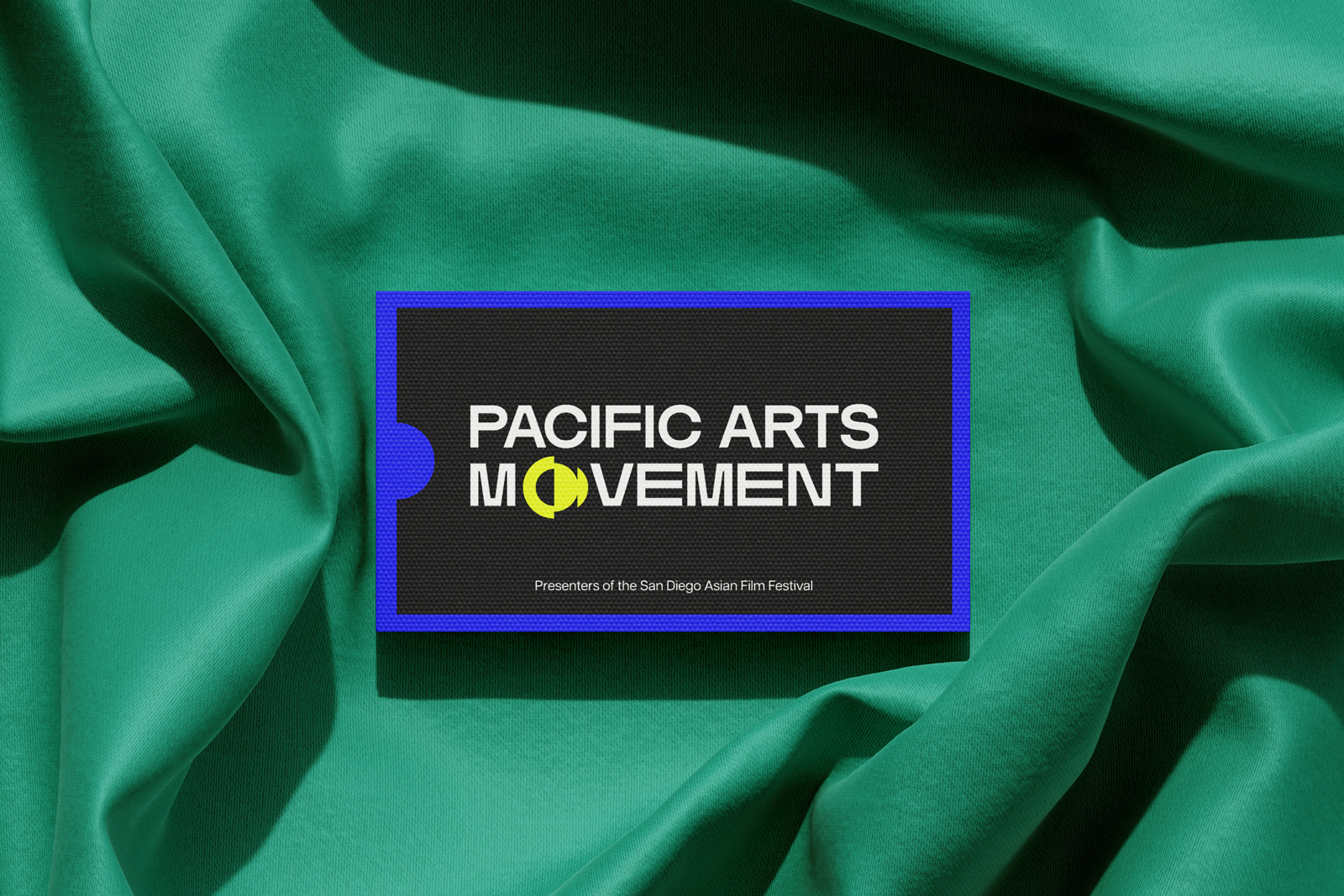
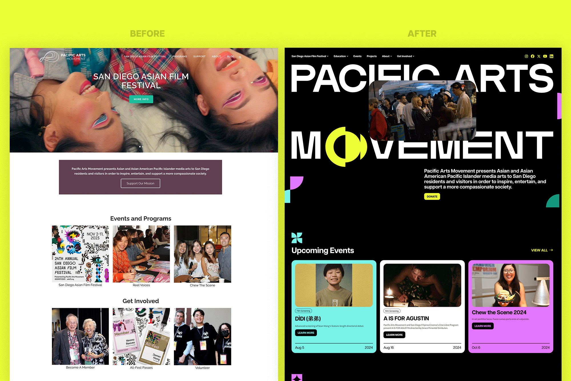
To mark 25 years of uplifting Asian, Asian American and Pacific Islander media in San Diego, the Pac Arts team requested a rebrand that would better communicate their culture of experimentation, playfulness, and courage. Their previous brand created back in 2013 had seen them through the creation of multiple media and educational programs and the growth of the largest Asian film festival on the West Coast. Still, it was time to evolve and reflect the boldness and innovation of the artists and filmmakers they’d worked so hard to celebrate.
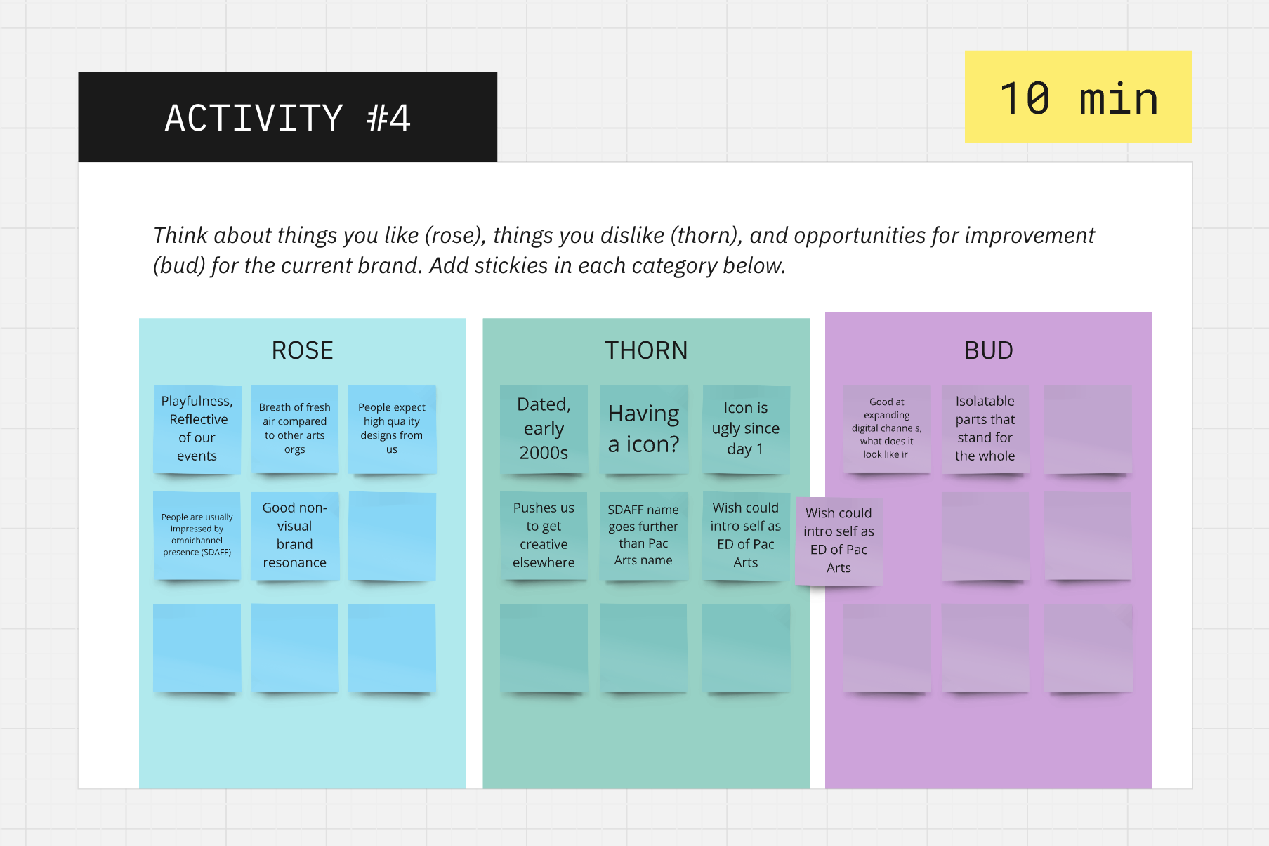
Brand Discovery.
Through the brand discovery consultation, we learned that there were many diverse audiences that Pac Arts wanted to reach. While they were well-known to Asian and Asian American filmmakers and locals, the team wanted to reach artists and locals who would resonate with their programming beyond cultural representation.
In addition, while many were familiar with the San Diego Asian Film Festival (SDAFF), Pac Arts was more of a background entity. In the end, we uncovered a few challenges:
- How might we build a brand that matches the experience that Pacific Arts Movement delivers?
- How can we leverage the Pac Arts brand to attract filmmakers who may be deliberating on showing their films with SDAFF or other festivals?
- How can we elicit the same excitement and energy for Pac Arts that SDAFF creates?
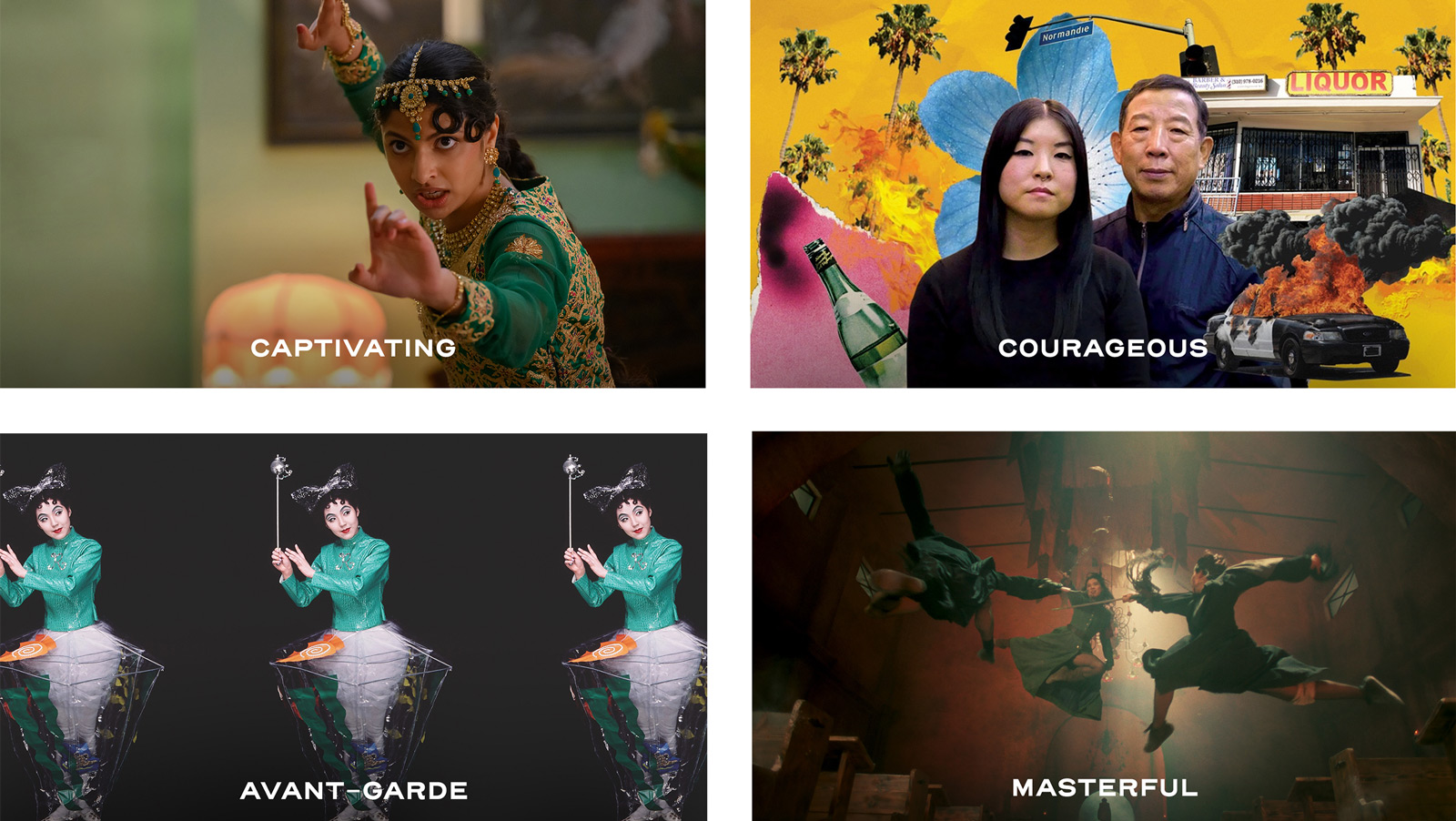
In order to guide the brand process, we identified four key personality traits that the new brand needed to exemplify.
Captivating. Pac Arts seeks to share stories and artists that awaken new ideas, highlight untold perspectives, and mesmerize audiences. Their new brand needed to evoke intrigue and passion.
Courageous. As a steward of Asian, Asian American, and Pacific Islander filmmakers and media creators, the Pac Arts brand needed to feel bold and unafraid of experimentation.
Avant-Garde. From first-time filmmakers to veteran movie masters and everything in between, Pac Arts never shies away from the provocative or seemingly strange.
Masterful. The Pac Arts brand should give the same polished and perfected impression that matches the excellence they bring to creating amazing experiences for their audiences.
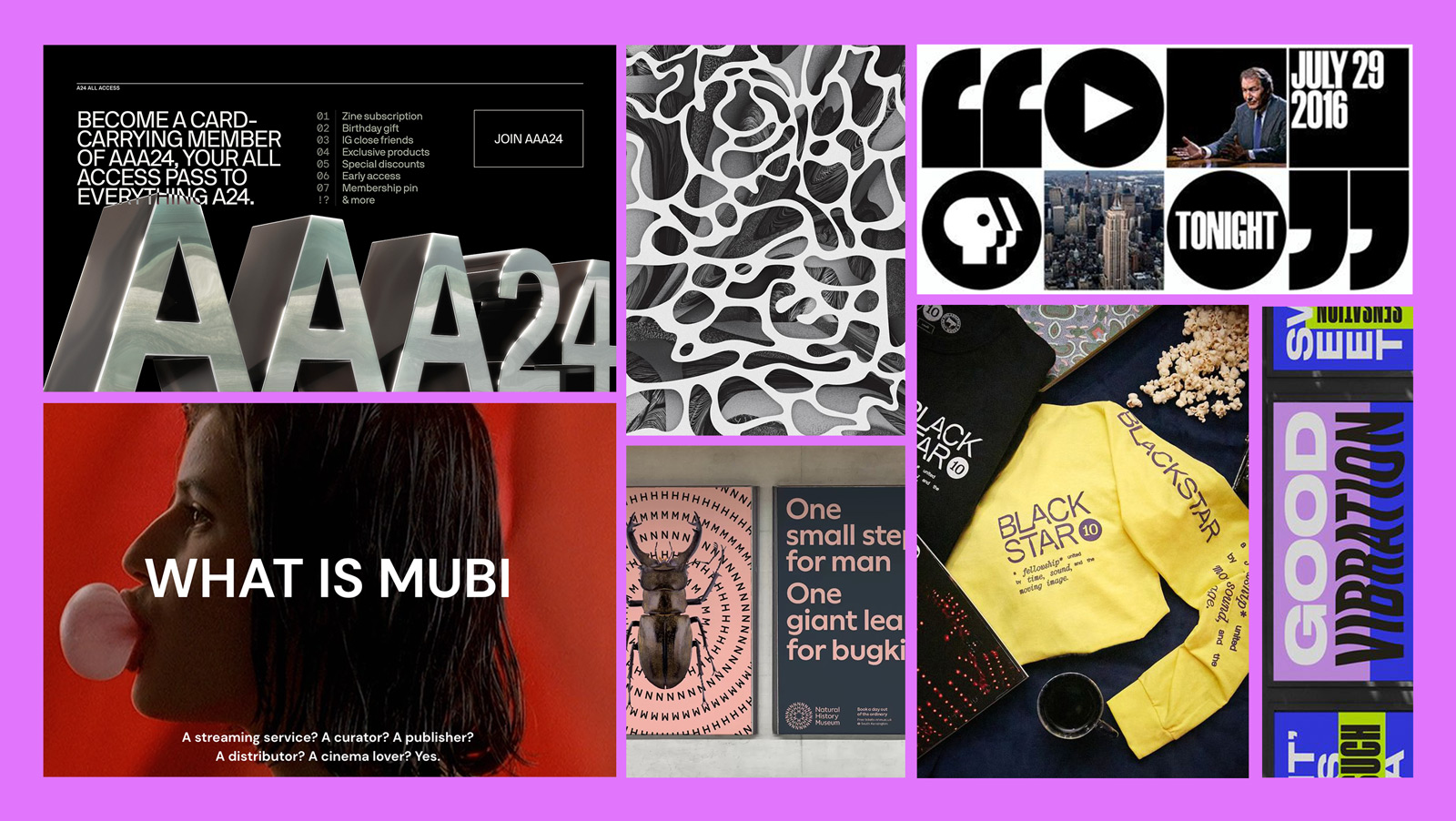
Mood Board.
Pac Arts named a few brand mentors that would help communicate how they wanted to be seen in the space. Film production and distribution companies like A24 and Mubi were noted for their original and groundbreaking projects, while simultaneously not taking themselves too seriously. The BlackStar Film Festival based in Philadelphia is icon for any film festival organization for their playful and thought-provoking designs. Other tactics that inspired the rebrand were patterns used as image masks and bright, neon colors.
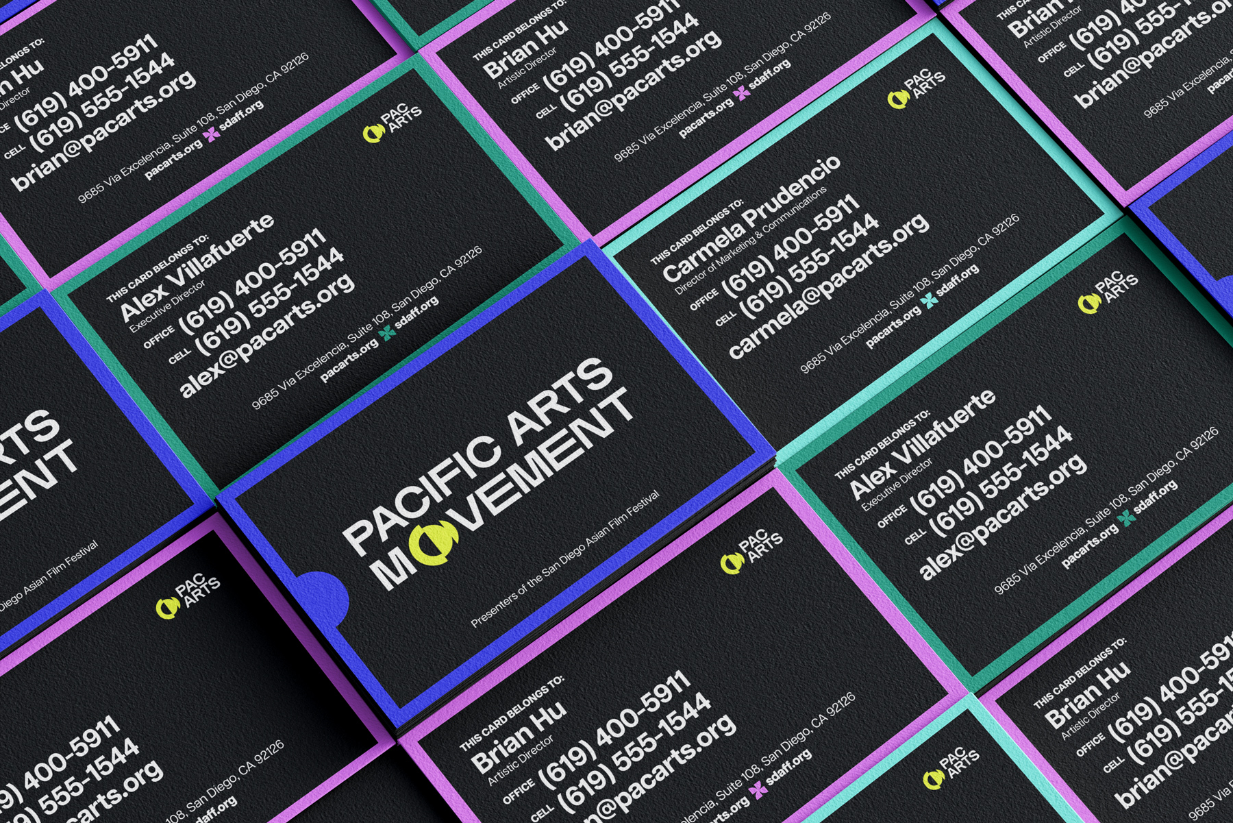
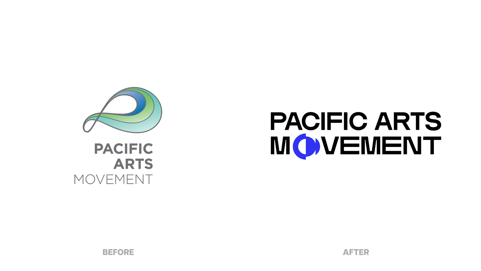
The Rebrand.
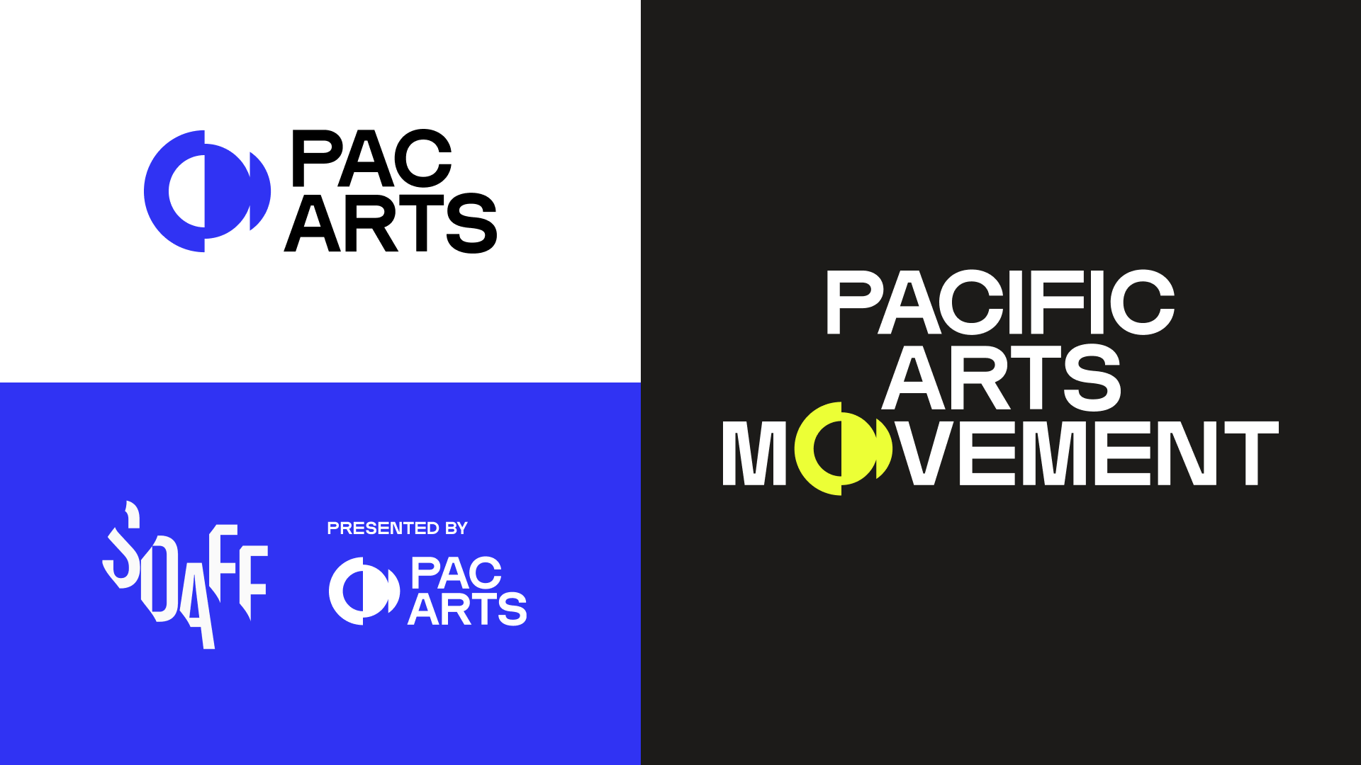
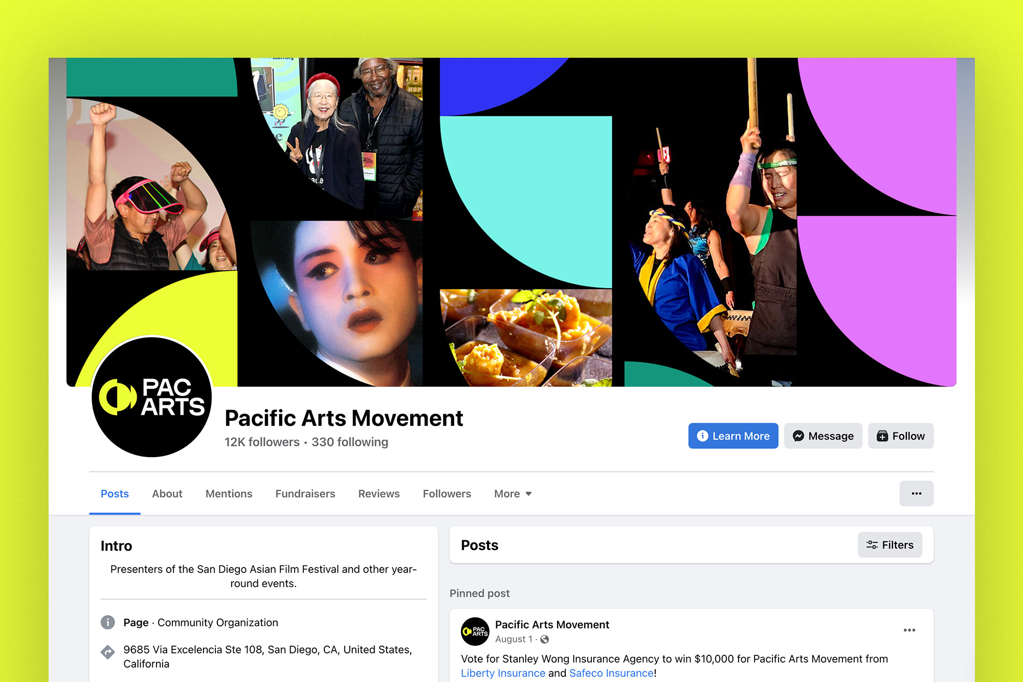
We built upon the previous logo’s concept of oceans and waves to continue that throughline, because every Asian and Pacific Islander culture has some relationship to the ocean. But the new brand would draw from the force which guides the ocean’s movement — the moon. The moon influences our perception of time, seasons, and for some astrology nerds in the room, our perceptions of everyone and everything! The icon mimics moon phases and playfully questions what is hidden and what is shown. As Asian and Pacific Islander cultures are desperately thrust into the limelight, it asks, what are the limits of representation? When our desires for legibility are met with cliché attempts from the mainstream, perhaps the Pac Arts brand can explore what it’s like to occupy the negative space.
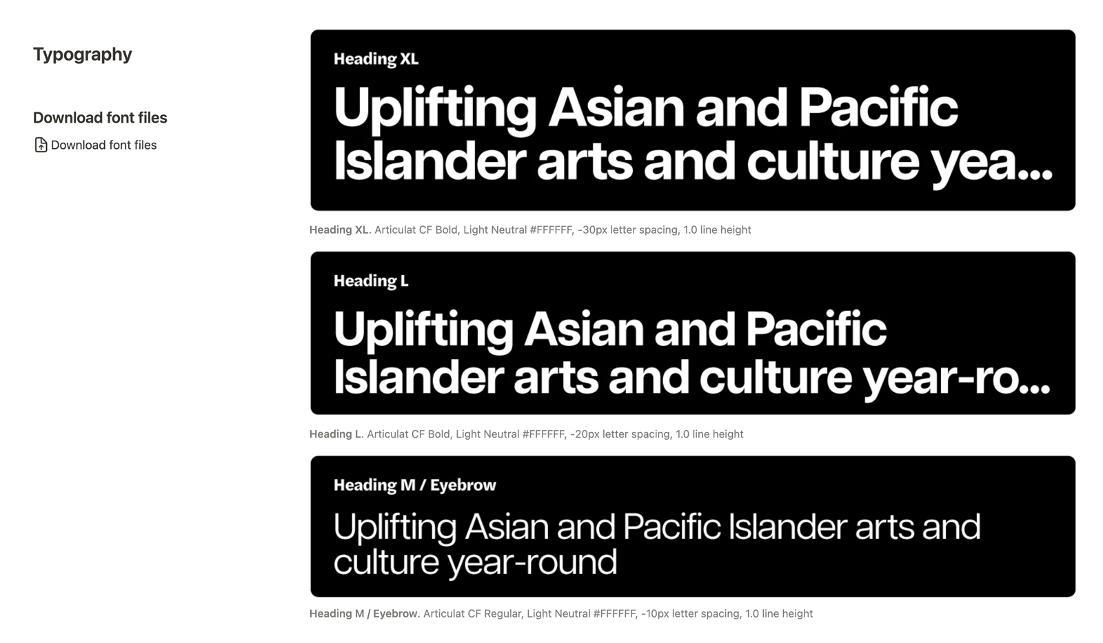
After many iterations, we moved the icon into the wordmark itself to release the pressure of having a single symbol representing the organization. The colors were reminiscent of an electric ocean, bringing more vitality and energy to the blues and teals in the original palette.

Website Redesign.
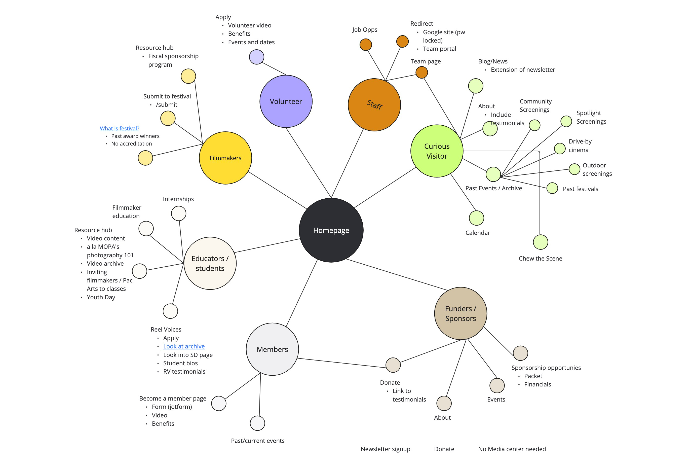
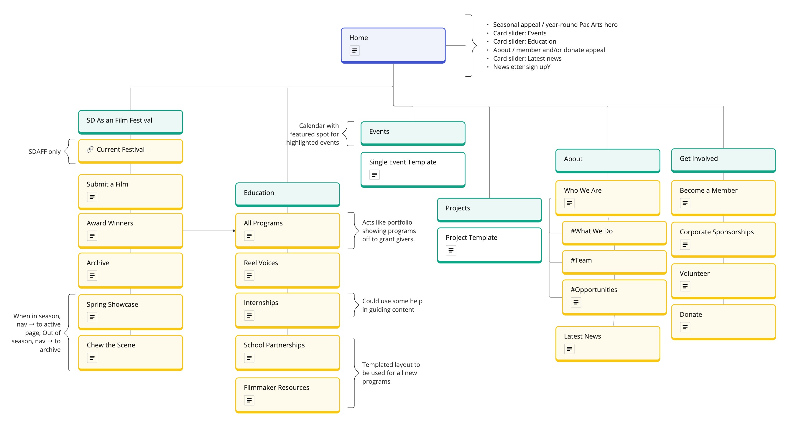
The biggest test of a rebrand is how it adapts to a full website with 25 years of past programs and history. With the help of web developer Ellie Nguyen of 3arly July, we took a chaotic, plugin-fueled WordPress site and built a new structure and content management system through Webflow. We began by exploring what jobs the website would fulfill according to different audience groups, then created a sitemap that identified templated sections to allow the website to grow over time.
One challenge was how to promote their flagship events and timely announcements alongside pages that archived past festivals and programs. Using the Webflow CMS, we created a system of toggles and fields to easily activate SDAFF-live or non-SDAFF versions of the website. We also designed event pages that accommodated multiple event types and formats including a multi-film presentation mode, multiple admission levels, and photo gallery for previous iterations of the event.
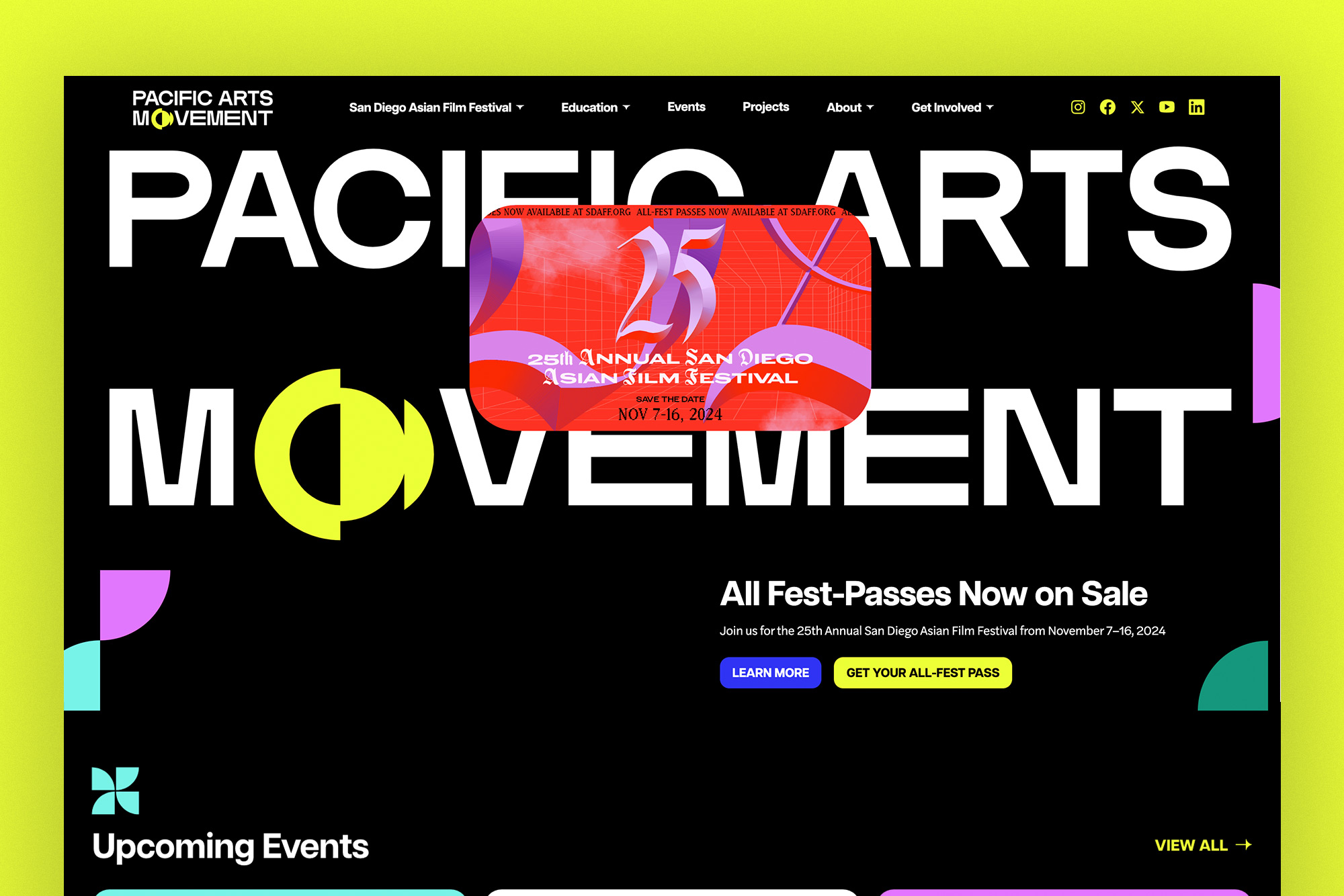
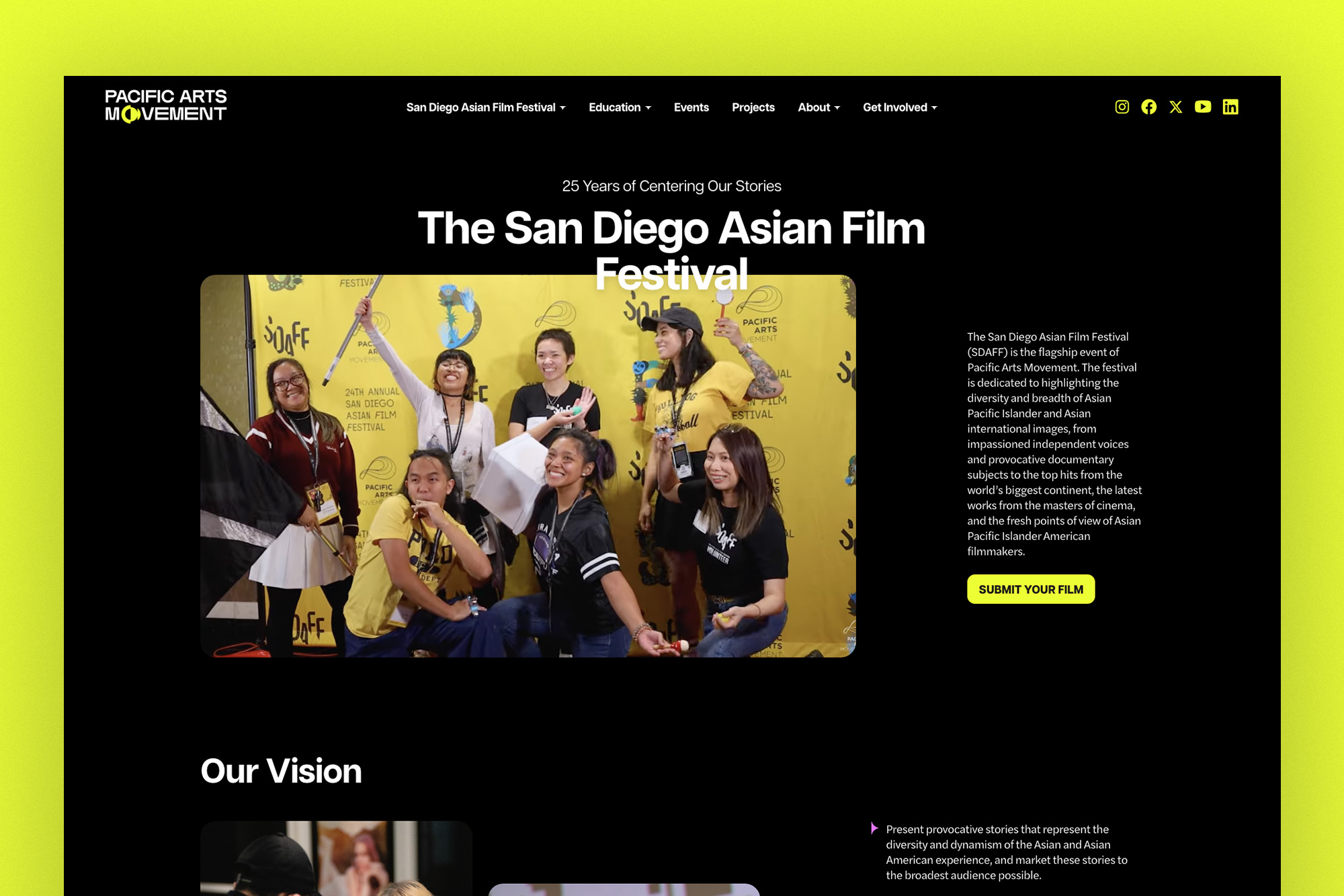

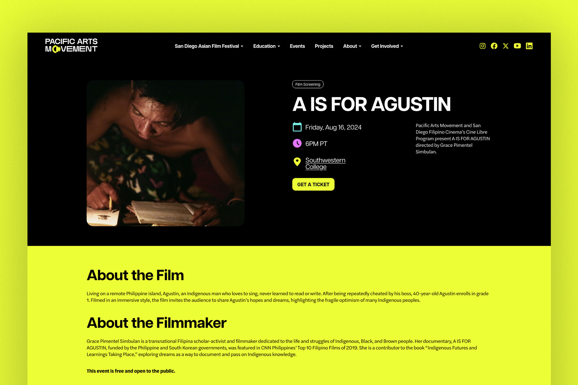
Launch the website prototype or visit the Pac Arts website live.
Pac Arts Rebrand Team
- Brand and website designer: Stacey Uy
- Brand designer: Jannah Maling
- Website developer: Ellie Nguyen, 3arly July
- Marketing direction: Carmela Prudencio
